Aurum
An augmented reality experience for the Carnegie Natural History Museum rooted in immersive storytelling, experiential learning, and participatory experiences.
Team
with Hannah Koenig, Michelle Cedeño, and Yiwei Huang
Time
6 weeks, CMU Interaction Design Studio Fall 2019
Role
Design Research, Conceptual Design, Interaction Design, Visual Design, 2D/3D Prototyping
Tools
Cinema 4D, After Effects, Illustrator, Figma
Project Objectives
In 2029, you have been tasked to improve the user experience of the Carnegie Natural History Museum with interactive environments that are:
Multisensory
How can visitors engage with more than their sense of sight?
Immersive
How can an immersive environment foster more engagement?
Responsive
How can a designed system adapt to changing behavior and environments?
Today, many museums are facing the challenge of transitioning from rigid institutions to experiential and flexible spaces. This is driven by such factors as expanding collections, increased competition for visitors, and visitor expectations for greater engagement. Museums are turning to virtual reality, apps, and interactive experiences to keep tech-savvy visitors engaged.
The Outcome
Aurum is an augmented reality experience using smart-glasses technology that invites curious minds to explore the impact of human activity on the natural world through experiential learning, personalized information browsing, and the power of participation.
System-level User Journey
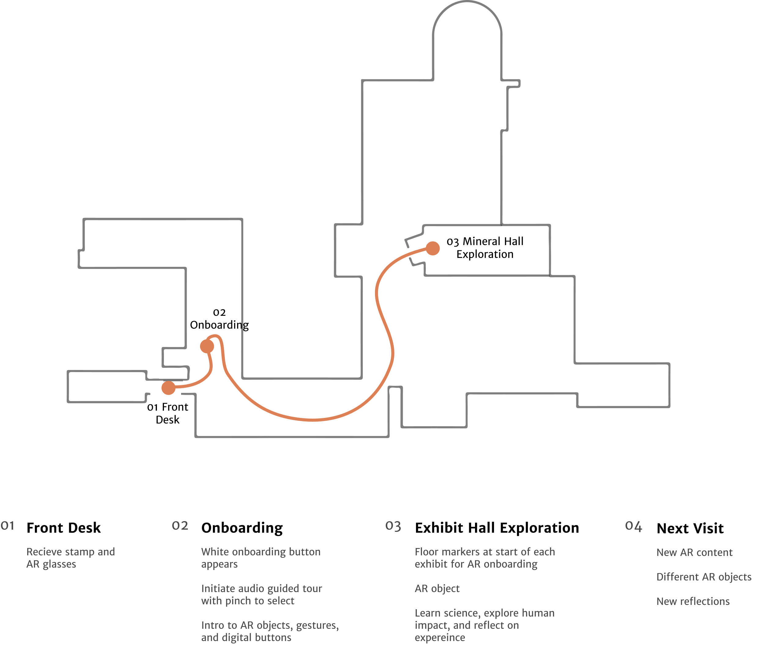
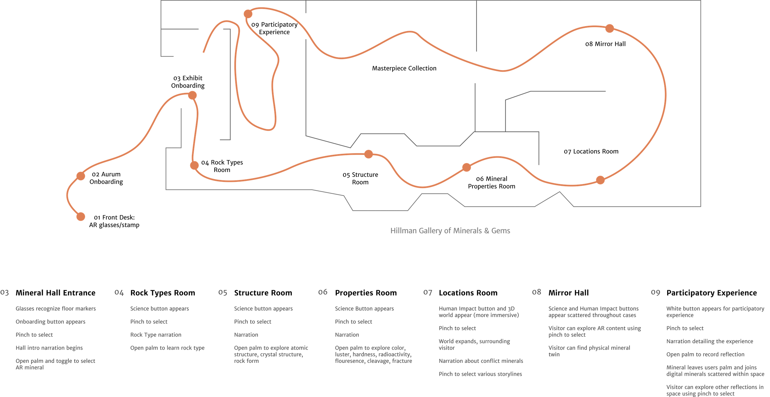
Exhibit-level User Journey
01 Arrive at the Museum
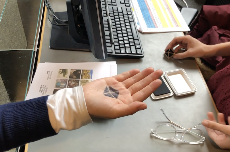
Upon arrival, visitors receive their ticket, smart AR glasses, and a palm stamp. Smart glasses reveal AR content and the palm stamp serves as an image anchor for an AR virtual object.
02 Aurum Onboarding
During onboarding, visitors are introduced to Aurum and different gestures that will help them navigate through AR content.
03 Exhibit & Virtual Object Intro
As visitors explore the museum, floor makers indicate the start of AR-enabled exhibits. At the start of the Mineral Hall, visitors are introduced to the narrative of the exhibit (conflict minerals) and can choose a virtual mineral to guide their experience.
04 Learn Natural Science
Visitors can explore mineral geology, atomic structure, and properties. Properties include fracture, cleavage, radioactivity, fluorescence, and hardness.
05 Explore Human Impact
After learning about mineral science, visitors can explore human impact stories in a more immersive experience. Stories follow miners, supply chains, or global efforts around conflict minerals.
As visitors navigate through the space, they can discover their virtual object’s physical form and continue exploring more AR-enabled content.
06 Reflect on Experience
At the end of the exhibit, visitors can engage in a participatory experience by sharing or listening to the reflections of others.
07 Continue Discovering
Visitors can navigate through other AR-enabled exhibits.
System Controls
Aurum uses hand-tracking as an input modality. Visitors can navigate digital content using six gestures.
open palm
reveals virtual object
bloom
reveals system menu
pinch
to select
toggle
switch between items
rotate
360 degrees
scale
up and down
Visual System
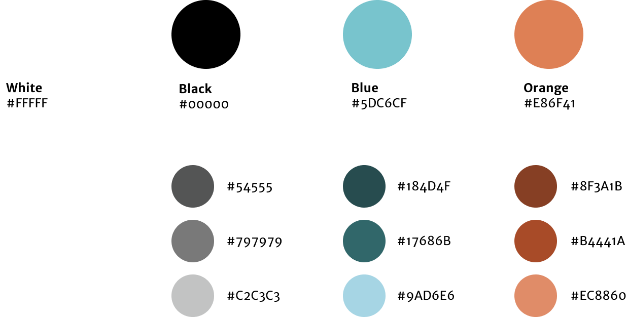
The Aurum logo was inspired by mineral geometry and Da Vinci’s Vitruvian Man. The Vitruvian Man was created during a time when people shifted their focus from God to humanity. We now hope to shift focus to humanity's relationship with the Earth.


Our Process
Exploratory Research
On-site Research
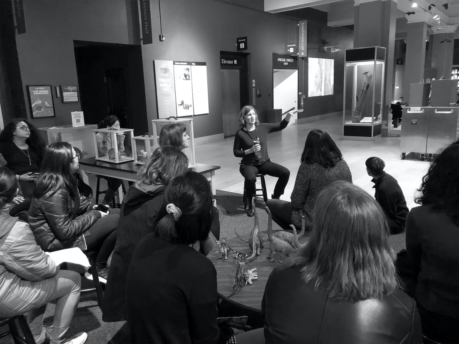
Our research began at the Carnegie Museum of Natural History. We had the opportunity to speak with Rebecca Shreckengast, Director of Exhibition Experience. She gave us valuable insight into the current museum experience from a curatorial and exhibition design perspective.
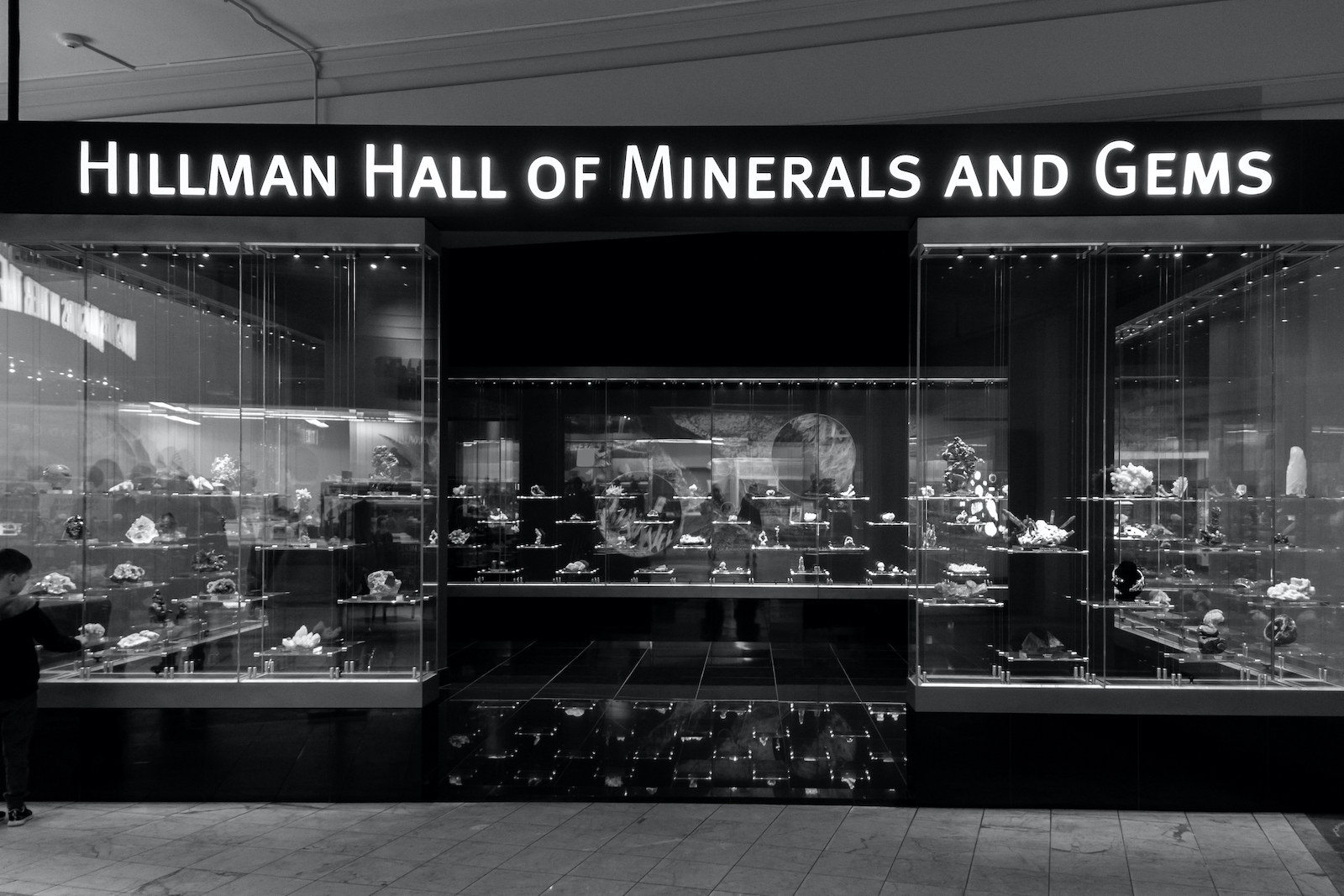
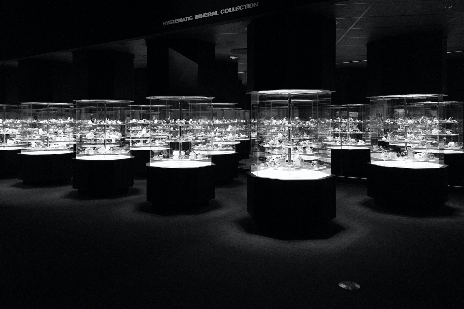
We also spent time exploring the museum space to observe how museumgoers, including ourselves, interacted with exhibits. After some time exploring, we found ourselves drawn to the Hillman Gallery of Minerals and Gems. This space houses thousands of minerals from across the globe, each on display in large cases. Although the space showcases the beauty of each artifact, minerals feel decontextualized.
On our next few visits to the museum, we had the chance to speak with a few visitors in the Mineral Hall. We approached several different types of people to help us understand how they felt about their experience.
The Participatory Museum
When thinking about increasing engagement within museums, we read through Nina Simon's The Participatory Museum. This book discusses how cultural institutions can become more dynamic, relevant, essential places. Visitor participation is essential when enhancing a museum's experience.
Competitive Analysis: Tools, Experiences, & Paradigms
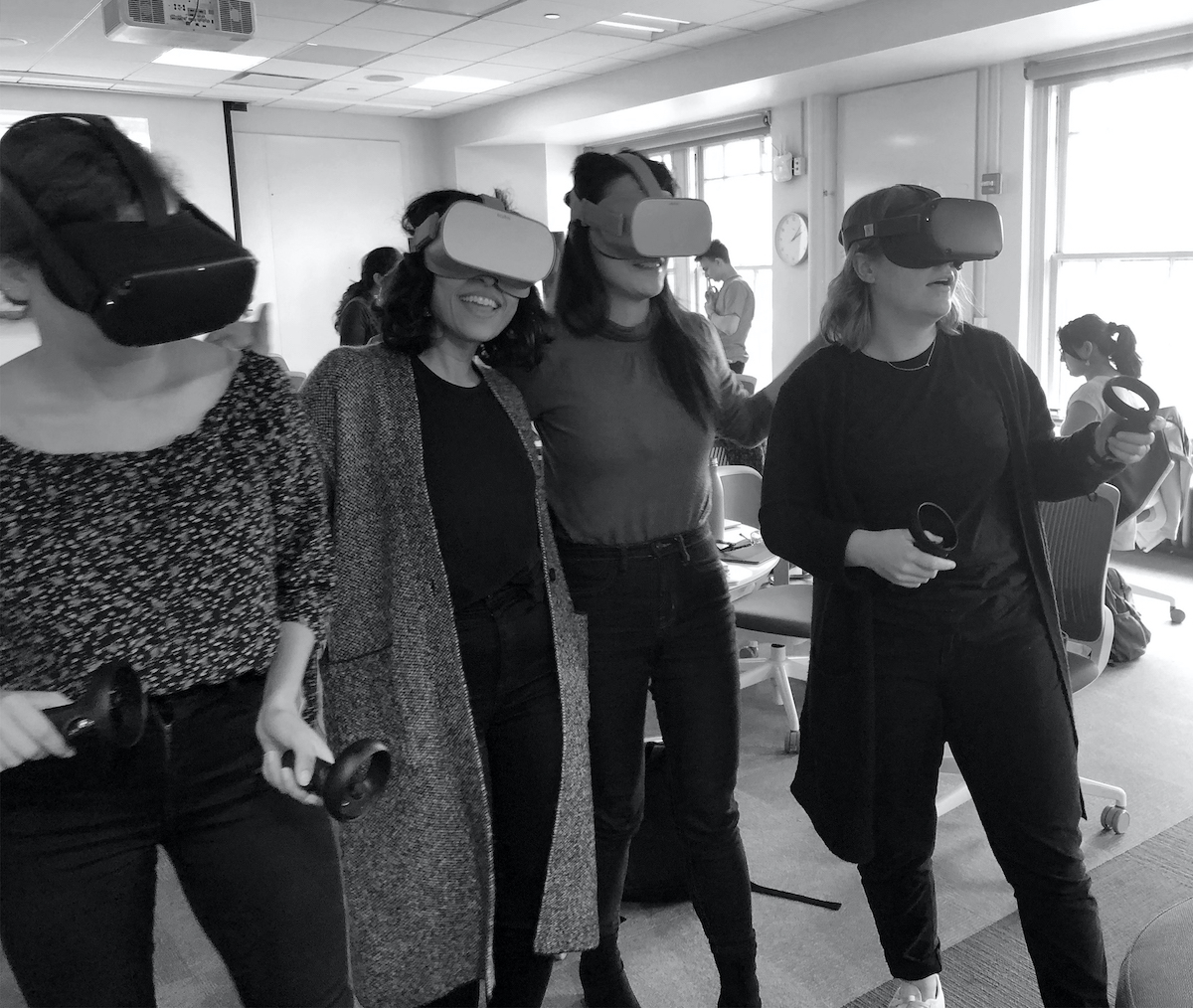
To begin understanding the technology we would be designing for, we took a look at mixed reality and virtual reality tools and experiences. Tools included the Oculus Quest and Hololens headsets and various AR prototyping tools such as Reality Composer, Aero, and Dimension. Experiences included teamlab’s Planets, Punchdrunk’s The Oracles, iart’s Hansel+Gretel, and The British Museum’s Museum of the World.
Research Synthesis
In our research, we uncovered four key insights. These insights became the foundation for us to begin defining our future experience.
0 1
Artifacts are missing context.
Minerals are decontextualized. The environments, ecosystems, and human relationships within which they are situated are not well represented.
02
Passive engagement.
This space requires little participation and engagement on the part of the viewer. Visitors only look at objects, as opposed to interacting with them.
03
Information is inaccessible.
The number of objects and accompanying visual content is a lot to digest, and can easily lead to cognitive overload and fatigue. Further, the content within the Mineral Hall is filled with scientific jargon that visitors may be unfamiliar with.
04
A larger narrative is absent.
A few successful experiences with the museum have strong, clear narratives structured around them. How can we create a stronger connection between viewer, artifact, and space by connecting to a bigger picture narrative? How can the space be more relevant to visitors?
Problem Framing
Based on our insights, we developed a guiding question. We continued to refine and specify this question as we pushed our concept forward.
How might we help the Carnegie Museum of Natural History foster more meaningful connections between people and natural history?
Design Principles
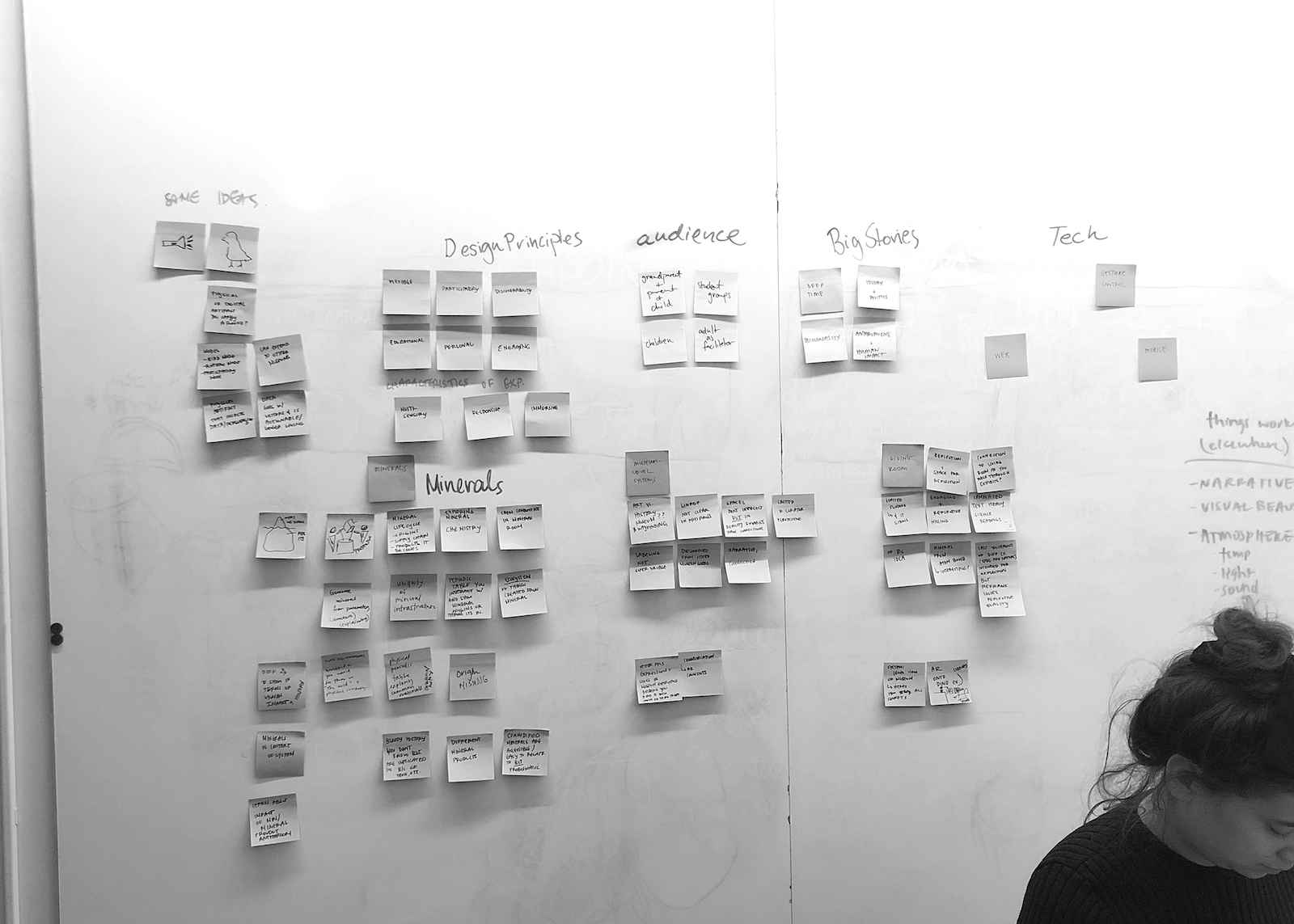
With our research insights in mind, we developed 5 design principles to help us better define our experience.
01
Recontextualize artifacts with multisensory, immersive engagement.
02
Celebrate and augment existing artifacts, rather than create a separate digital experience.
03
Develop a clear, big-picture narrative that ties each exhibit together and showcases human connections to natural history.
04
Create an accessible experience, allowing easy engagement with information.
05
Make the experience participatory. Actively engage visitors with content, then invite them to express themselves.
06
Build a museum-wide, systems-level experience.
Concept Generation
System Framework
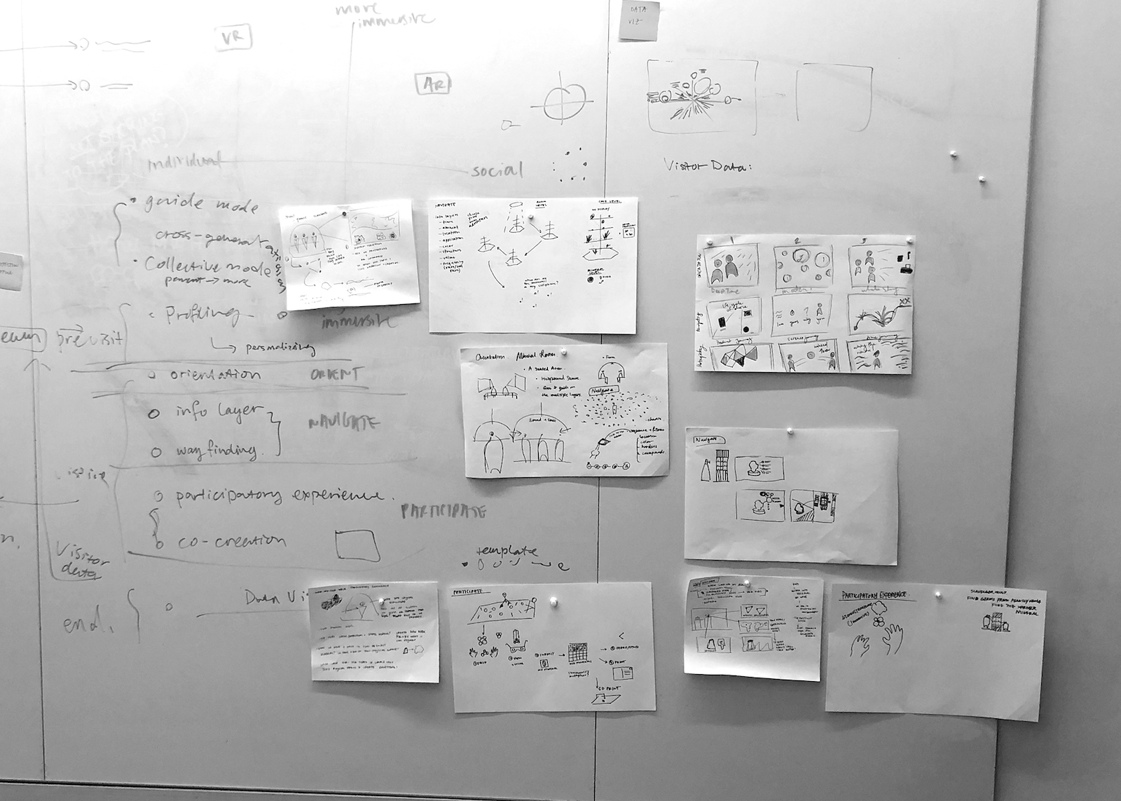
Before diving into ideation, we discussed a larger system framework. Based on our experience navigating through the Mineral Hall, we wanted three guiding phases for our experience:
01 Orientation
Visitors will be introduced to the exhibit with relevant background knoweldge.
02 Navigation
Visitors will expeirence guided wayfinding and exploration through space.
03 Participation
Visitors can engage in a participatory activity at the end of their experience.
Technology
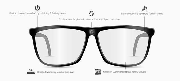
We also discussed leveraging AR smart glass technology. Smart glasses have the ability to create a more immersive, multi-sensory experience while still allowing users to navigate through space.
Ideation
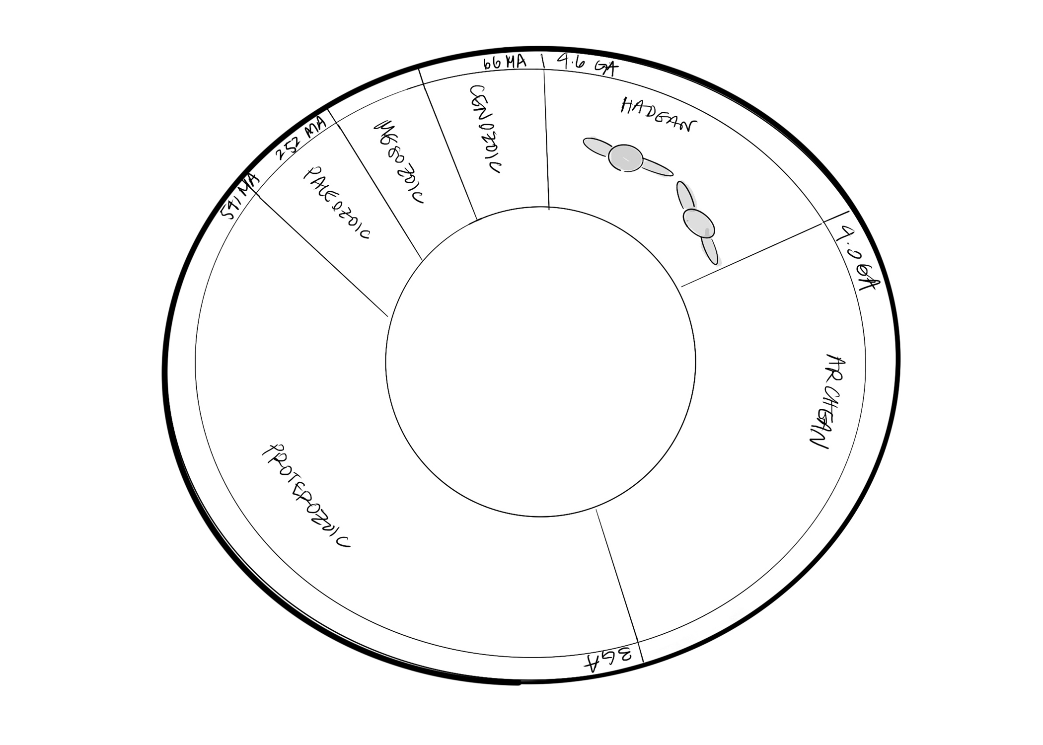
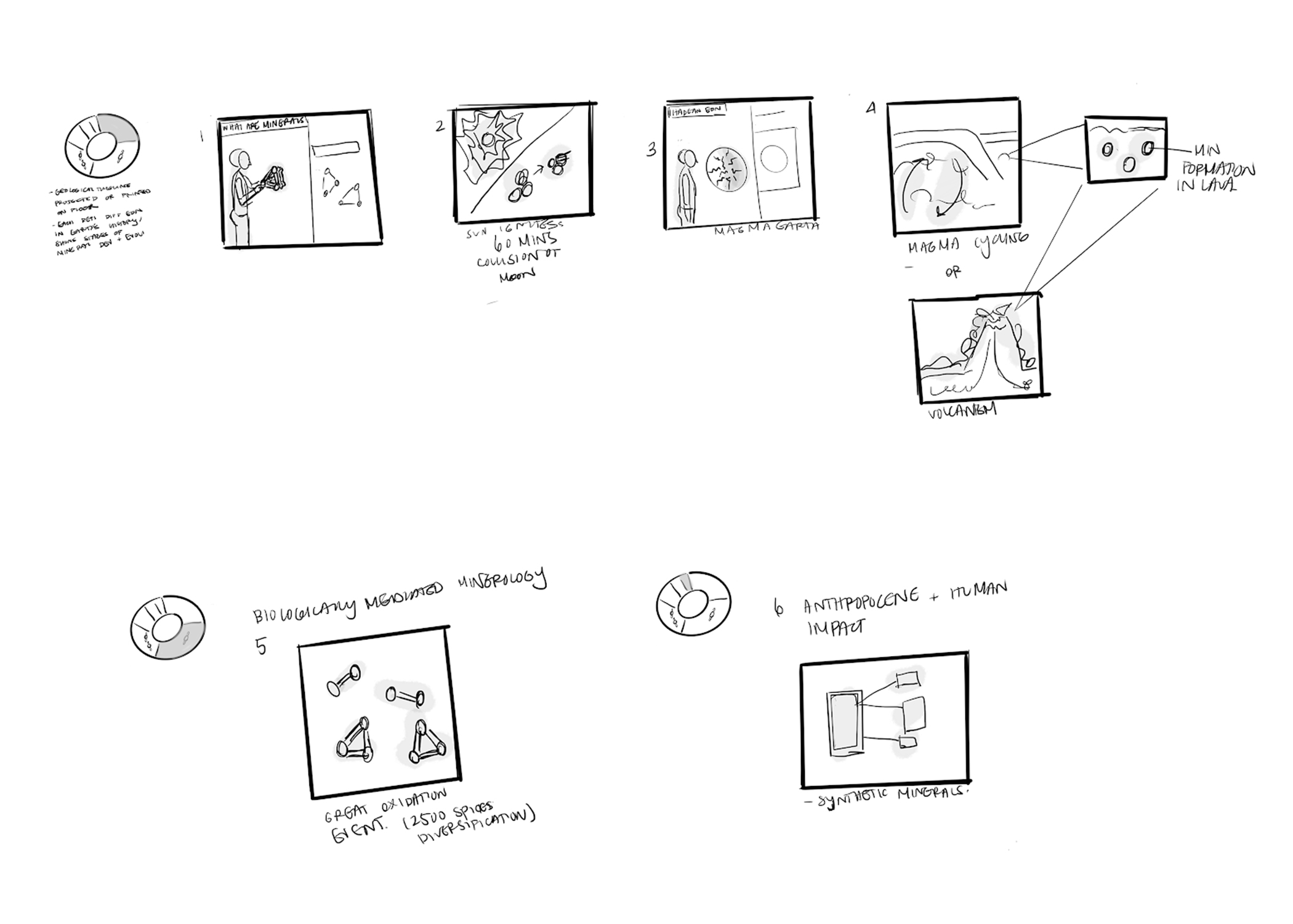
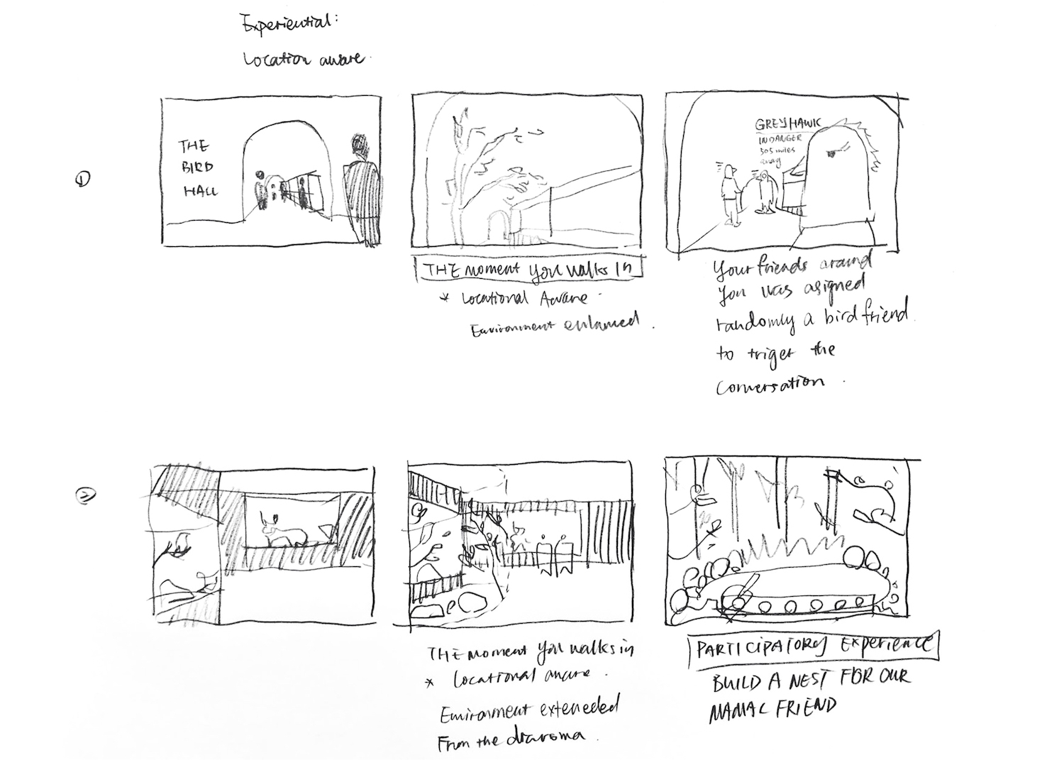
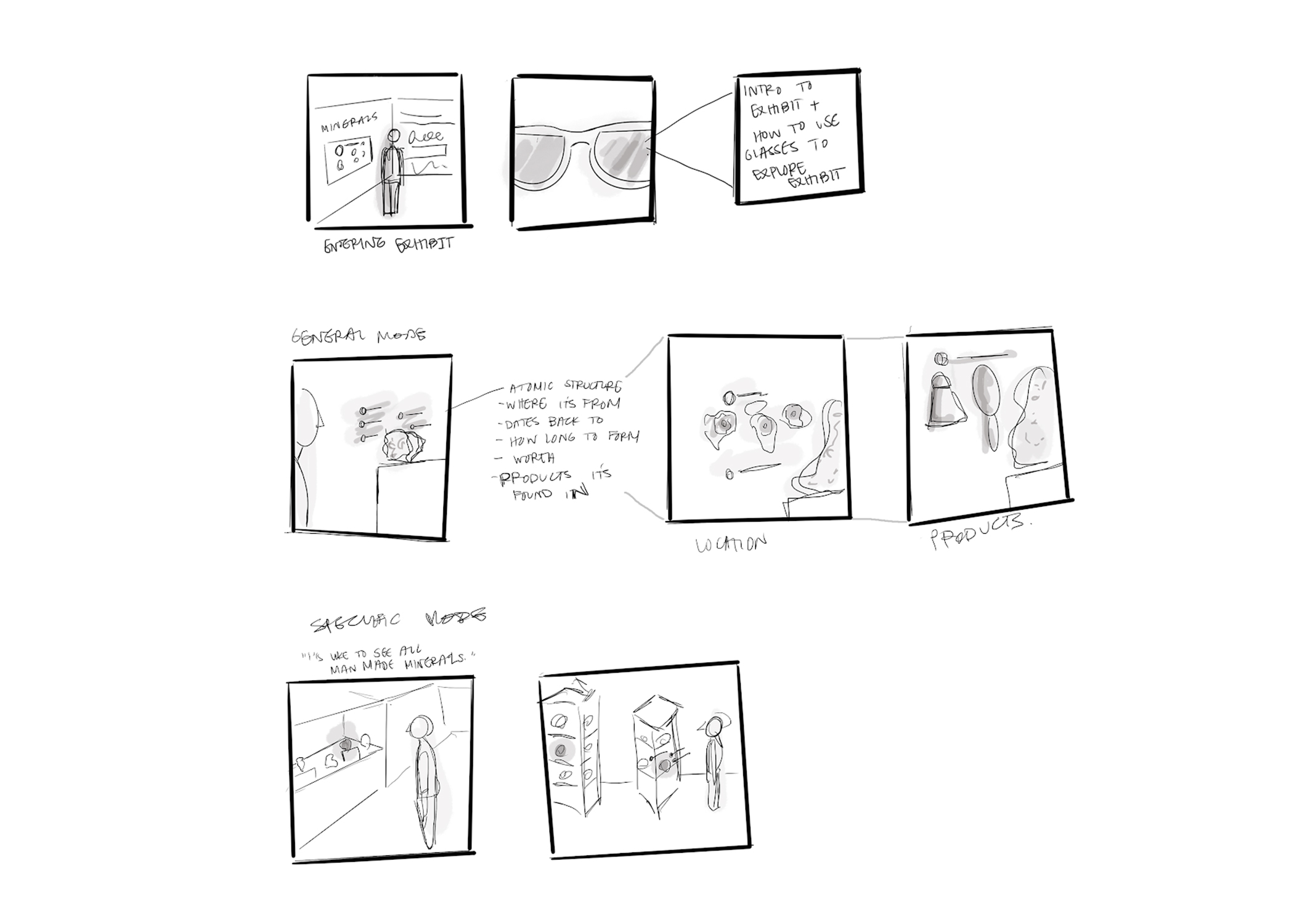
We then started generating rough concept ideas around our principles, framework, and technology.
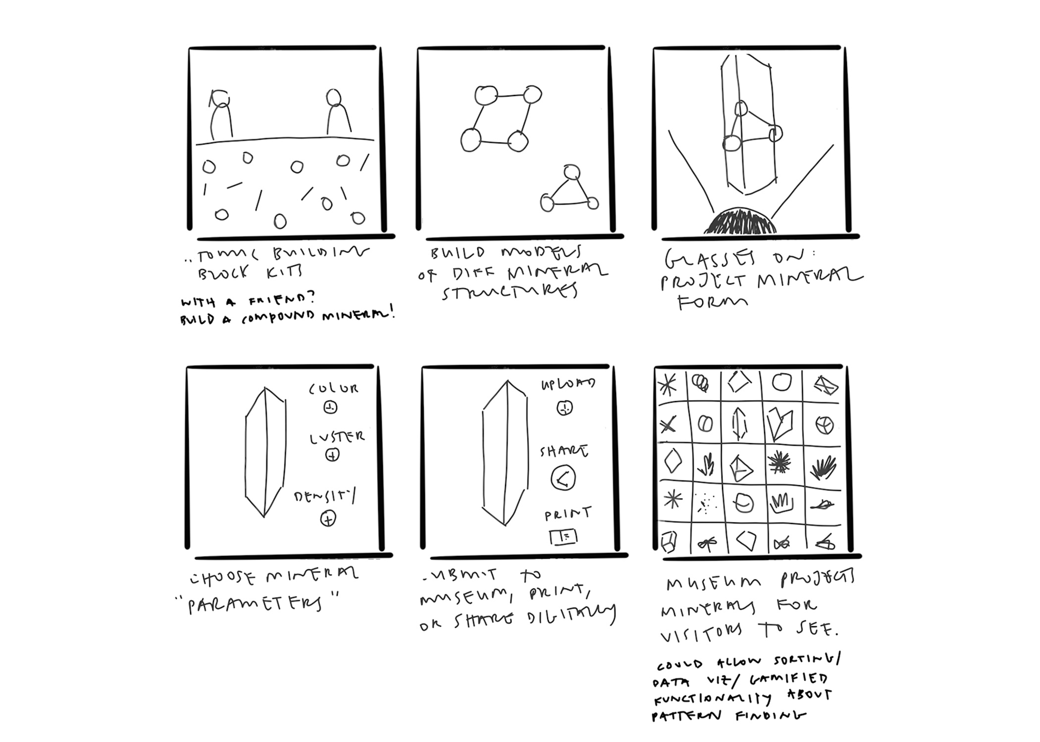
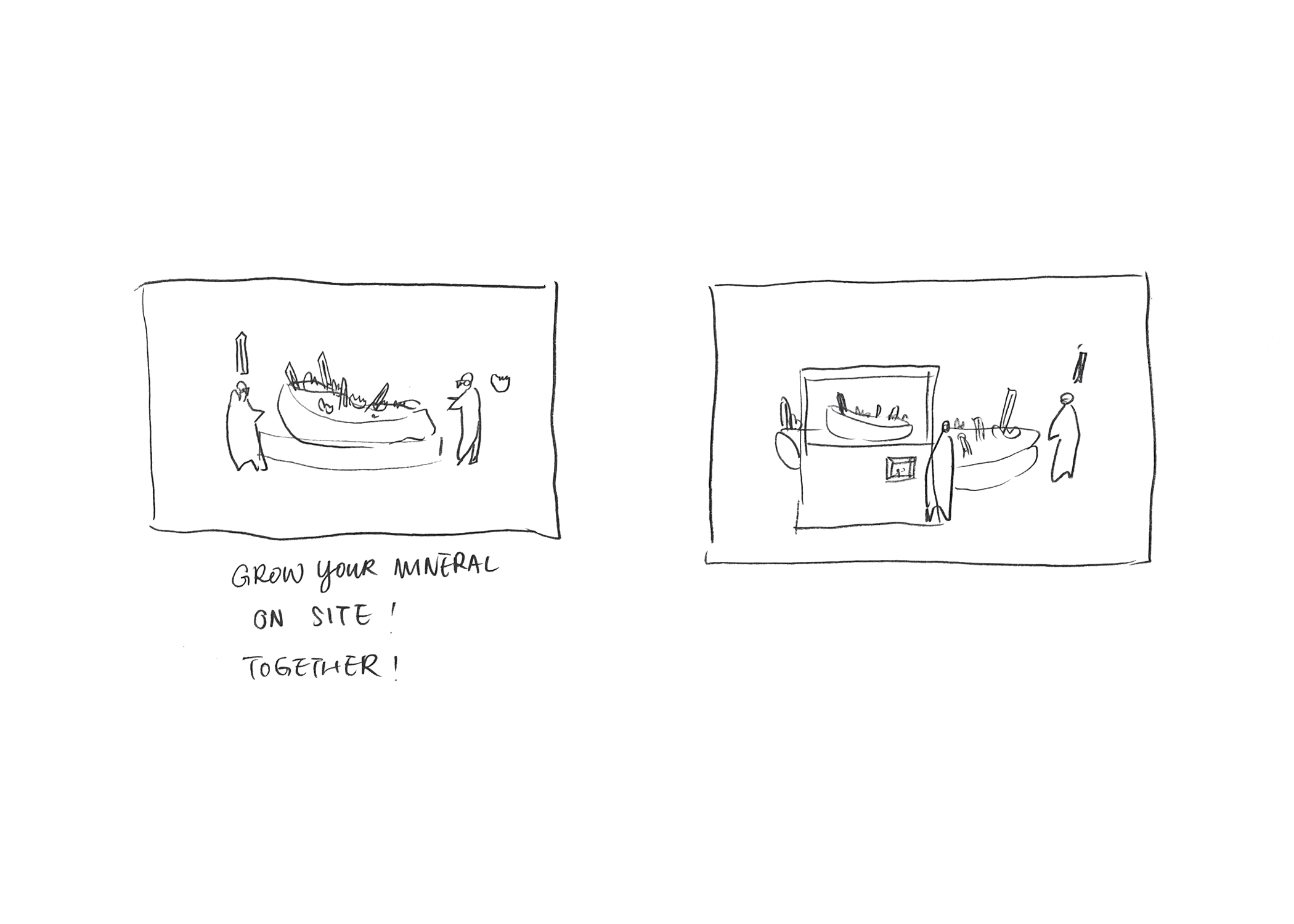
Concept Refinement
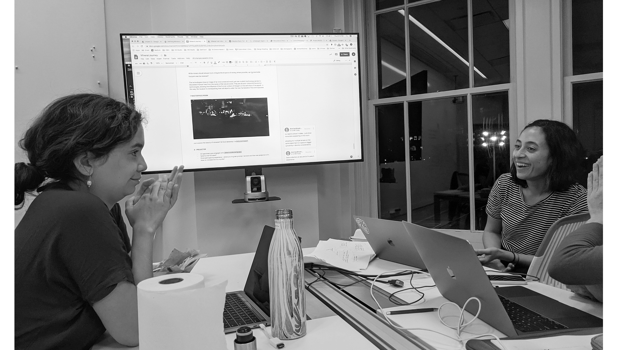
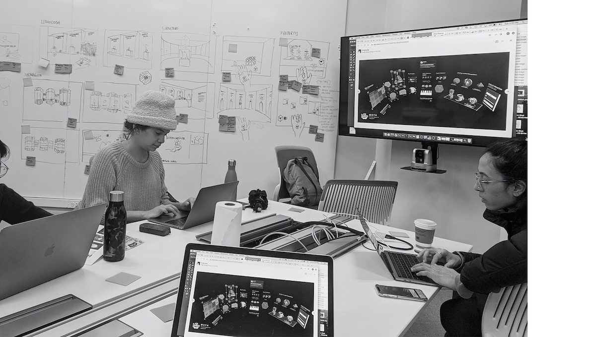
We had the opportunity to present our system framework and concepts to our peers and instructors. Based on feedback, we decided to scope down, refine, and dive deeper into the details of our project. We headed into another round of research, ideation, and prototyping.
We began by narrowing our narrative. After discussion, we landed on the idea of a personalized AR object. At the start of each exhibit, visitors will be given a virtual object specific to that exhibit. They can use the object to unlock more immersive learning experiences or content. We liked the idea of this object living in a user's palm, with gestures controlling the experience. This experience would leverage AR image recognition technology with the placement of an image marker on a visitor's hand.
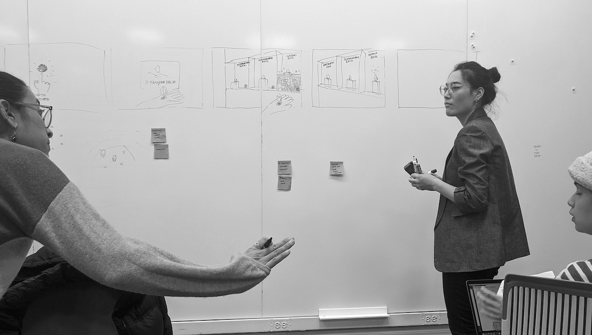

storyboard of our user journey
We also wanted our narrative to focus on human impact to increase the connection between museumgoers and natural history. We hoped to give users an introduction to natural history through an understanding of science, and then allow them to explore natural history within the context of their own lives.
How might the Carnegie Museum of Natural History use augmented reality to increase the connection between visitors and the natural world through:
Experiential Learning
Hands-on learning
Info Browsing
Connected content
Design & Prototyping
We had a highly iterative design and prototyping process. Researching existing paradigms and physical/digital prototyping were fundamental in helping us understand and push our concept forward.
AR and VR Interaction Paradigms
To make our narrative concrete, we looked into existing interaction paradigms for AR and VR. We looked at Oculus’ hand-tracking design guidelines and at LeapMotion and Hololens gesture-based apps. This helped us think about proximity, gesture controls, and digital signifiers.
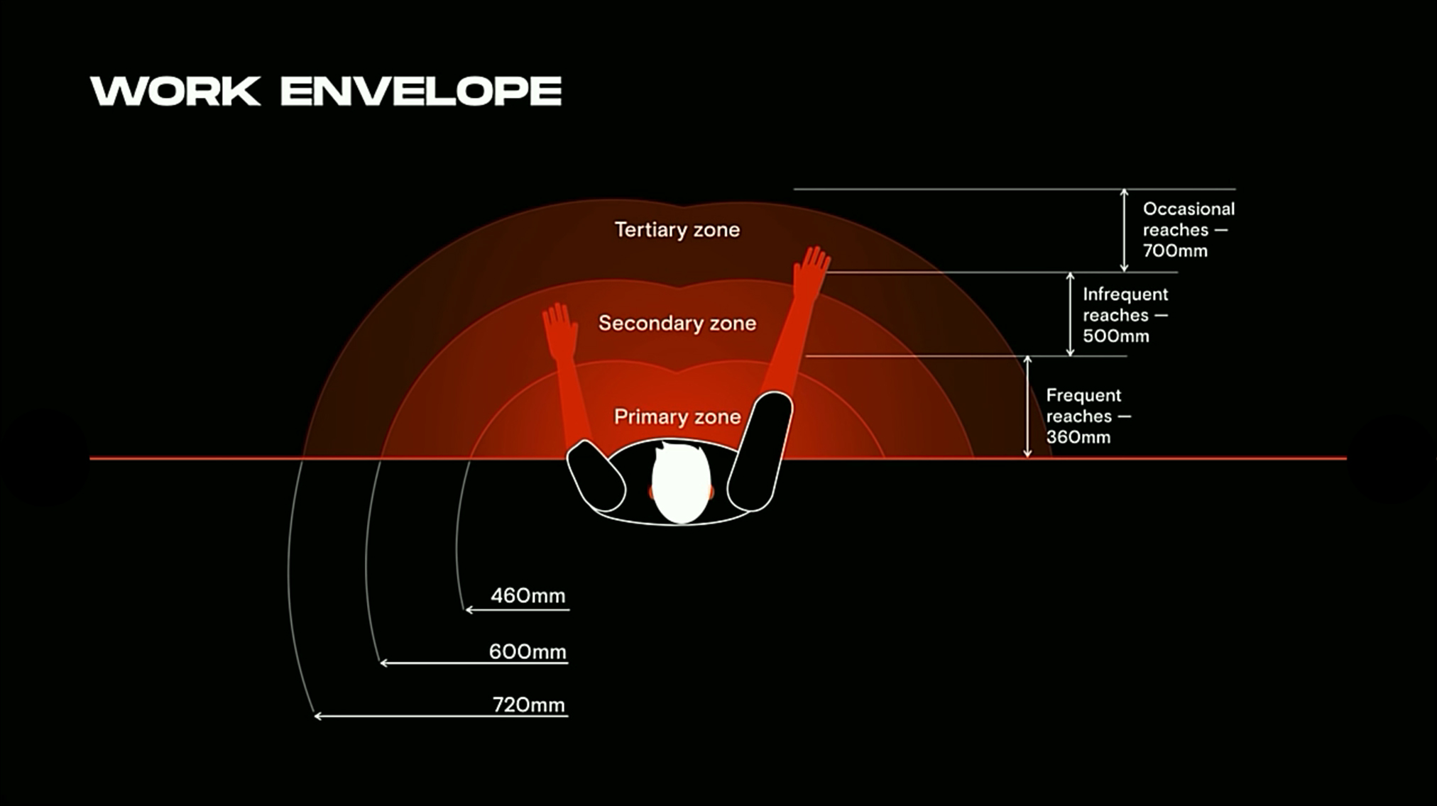
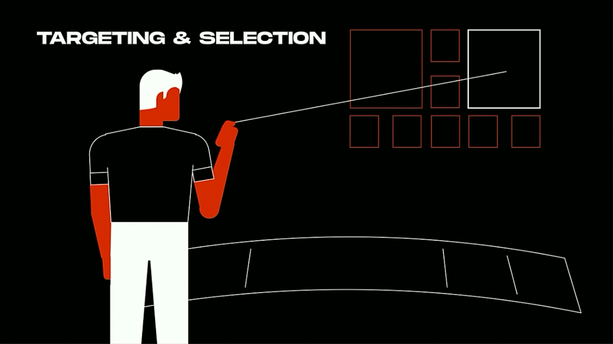
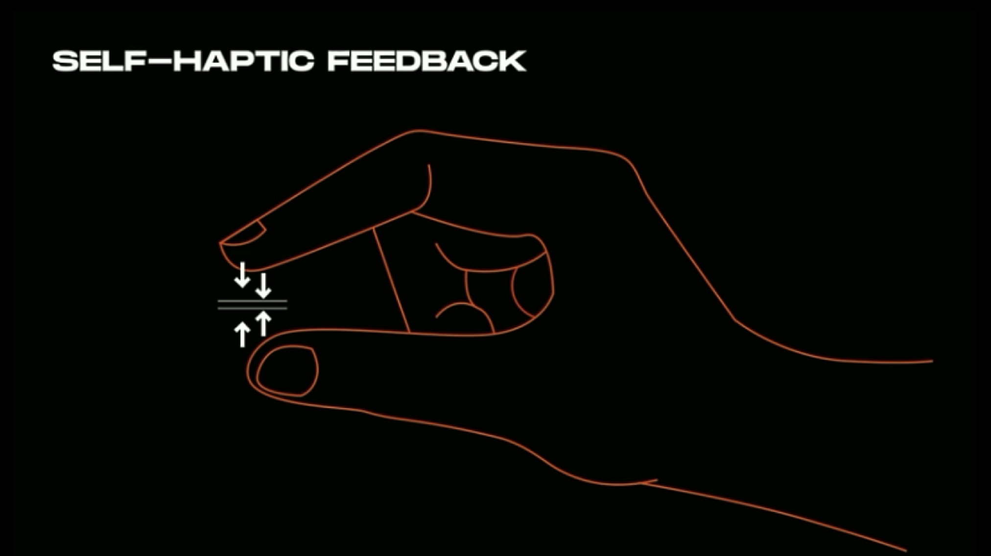
Oculus' hand-tracking paradigms: proximity, gesture controls, digital button signifiers/affordances
LeapMotion & Microsoft's Mixed Reality Toolkit: Handtracking, UX/UI Patterns
Explorations
3D AR Object & Gestures Controls
We started exploring our AR palm object through physical prototyping. This helped us quickly understand how our object might interact within a physical environment. We also started thinking about specific hand gestures that would allow visitors to interact with this object. We then moved into Cinema 4D and After Effects, creating and sourcing OBJ files and pairing them with live footage.
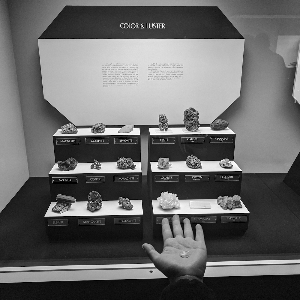
test in museum environment
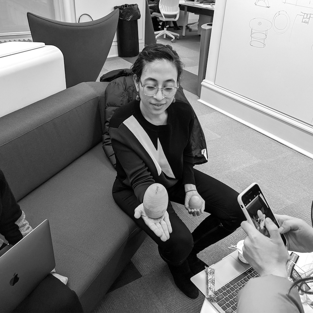
testing dimensions
explorations
cinema 4d render
pairing cinema 4d with live footage in after effects
Digital Buttons
Users can unlock AR content using digital buttons. We decided to make our system buttons 3D to leverage self-haptic feedback. We explored various button shapes, sizes, and colors by sketching, working in Figma, and prototyping in Reality Composer. We landed on a diamond shape because it aligned with our visual system and signified a pointer.
Our buttons are largely based on proximity. As a user approaches AR content, AR content will reveal itself by scaling up. As users move away, AR content will scale down or disappear.
reality composer prototype
2D User Interface
Drawing inspiration from existing AR/VR patterns, we started by hand sketching our UI and detailed interaction flows for both primary and micro-interactions. We moved into Figma to continue exploring higher fidelity mockups on static museum images. This helped us get a better sense of space and proximity. Once we decided on a final UI form, we created all assets in Cinema 4D and After Effects.

initial explorations and user flows / proximity
Participatory Experience
We wanted to end each exhibit's journey with a participatory activity, allowing museum visitors to reflect on their experience. After various iterations, feedback, and discussions, we landed on the idea of visitors navigating through space, sharing and hearing the reflections of others. We decided to make this experience voice-based for engagement, ease, and consistency.
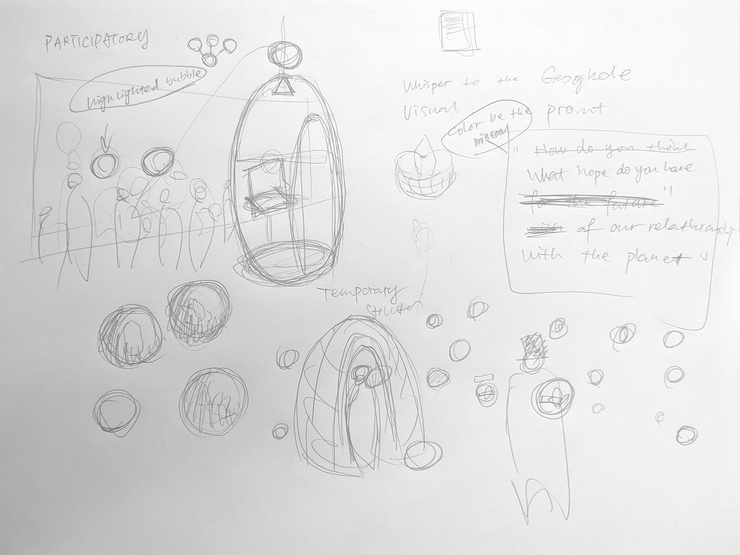
initial storyboard sketch
cinema 4d prototype
Reflection
This project was challenging, but a lot of fun. We had to consider 3D digital objects and how these objects would interact with visitors and within the museum's environment. Research, trial, error, and critique helped us figure out different ways to prototype our ideas. Along the way, we learned about paradigms, affordances, and signifiers for emerging AR and VR technology (haptic feedback, proximity, gesture control).
Digital prototyping was a meticulous process that required workflows between various tools. Through the six weeks, we used over 20 different tools:
3D Modeling
Cinema 4D, SketchUp, SketchFab
Hardware
Oculus Quest, Hololens, LeapMotion
Fast AR prototyping
Aero, Reality Composer, Unity, Dimension
UX/UI
Figma, XD, Illustrator
Video Production
After Effects, Photoshop, Lightroom, Audition, Premier Pro, GoPro
© 2022 — Amrita Khohsoo