RyeCatcher
An efficient and discreet way for teachers to track student behaviors in the classroom.
Team
with Michelle Cedeño, Louise Larson and Ashley Varrato
Time
5 weeks, CMU MA IXD Studio Spring 2019
Role
UX/UI Design, User Testing
Tools
Sketch, Illustrator, Photoshop
Project Objectives
We were tasked to design a tablet-based app that allows K–12 educators to track classroom behaviors for a range of students, including those on formal behavior plans (IEP, 504 plans).
Our client, RyeCatcher, builds an online collaboration software that enables parents and student advocates to build and manage a circle of support tailored to a student’s individual needs. Their tool also connects students with local support providers and facilitates tracking and monitoring of student response to interventions over time.
The Outcome
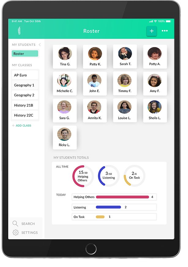
A tablet-based app that lets teachers quickly, easily, and discretely track student and class behaviors in a busy classroom environment. Teachers also have visibility into individual student behavioral plans and can understand patterns in behavior over time.


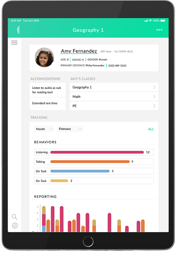
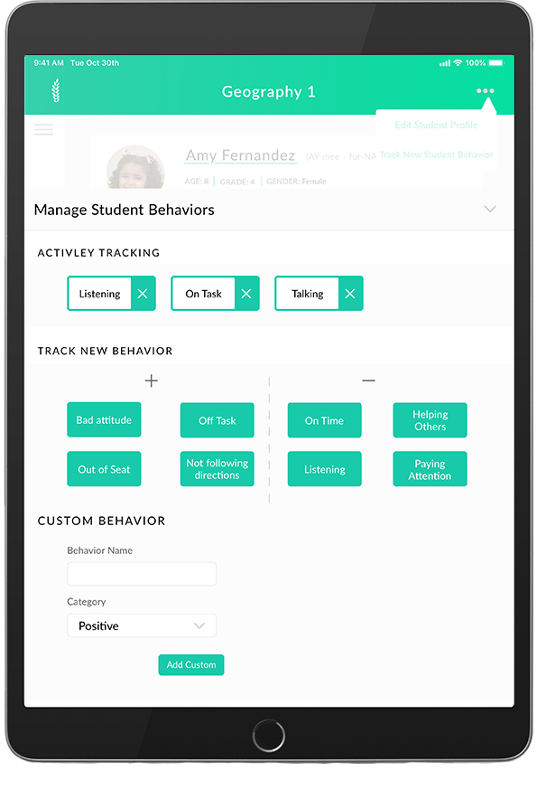
How might we help K-12 teachers track and understand students’ classroom behaviors in an easy and efficient way?
Exporatory Phase
As part of the project brief, we were given 6 user scenarios and a list of task requirements. Each scenario gave us insight into various classroom contexts in which behavior tracking was needed. The task list gave us a minimum number of requirements to design for. To prioritize tasks, we wrote down major themes from each scenario and affinity mapped.
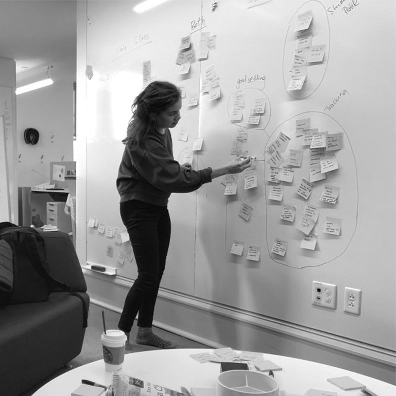
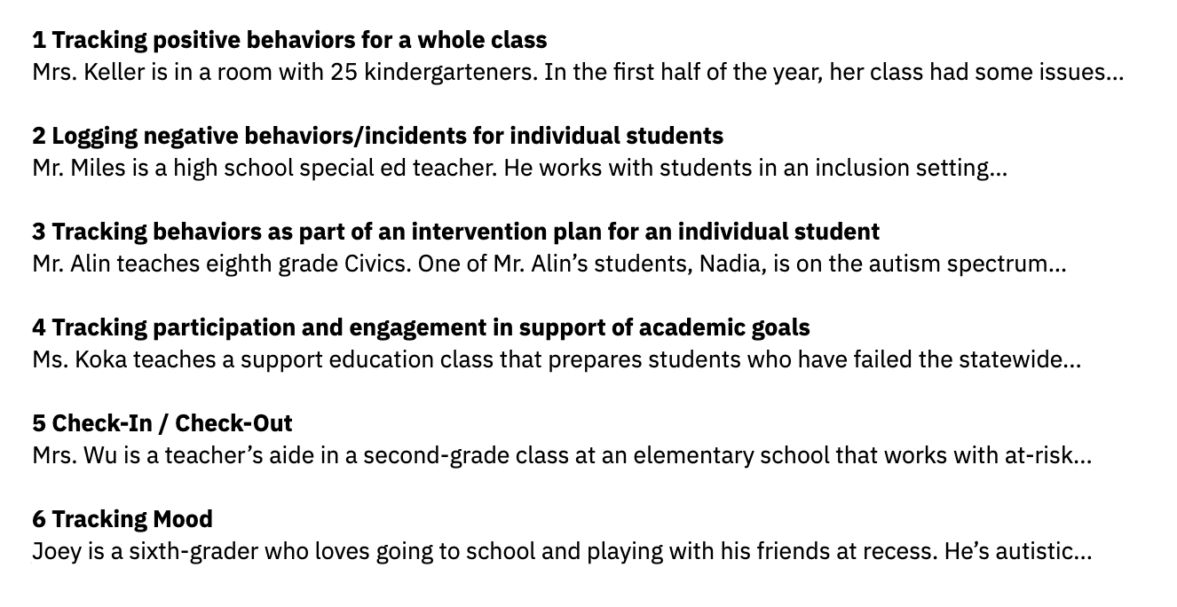
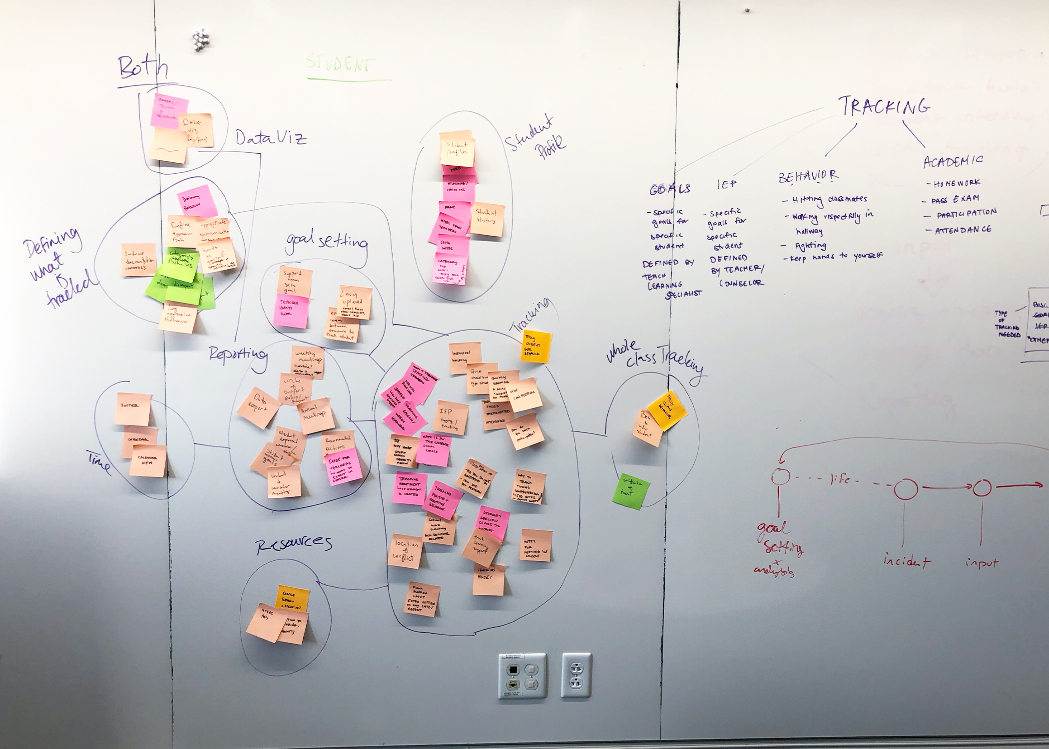
6 user scenarios and affinity map
Generative Phase
Based on our scenarios, we came up with version one information architecture for our app. We then started ideating by hand sketching, then coming together to discuss, synthesize, and push our design forward. As we moved through each iteration, from low to high fidelity, we relied on group synthesis, client feedback and user testing to iterate.
Version 1 Information Architecture

Initial Sketch Ideations

Version 1 Wireframes
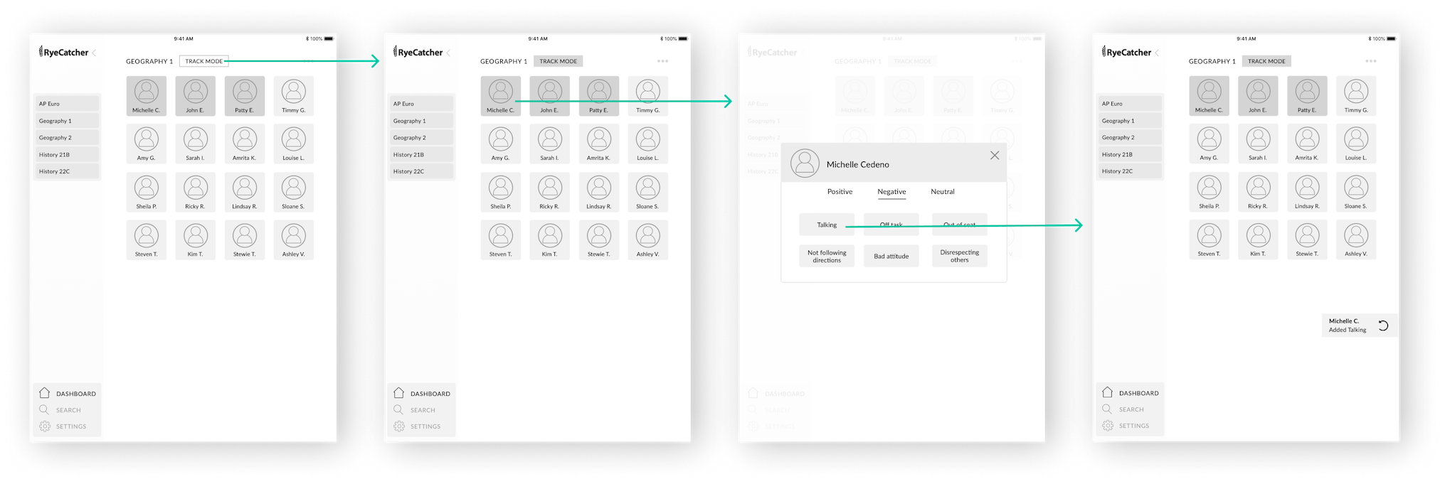
Class Home & Student Tracking Flow
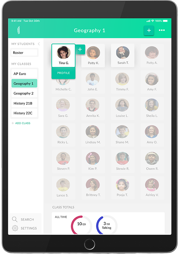
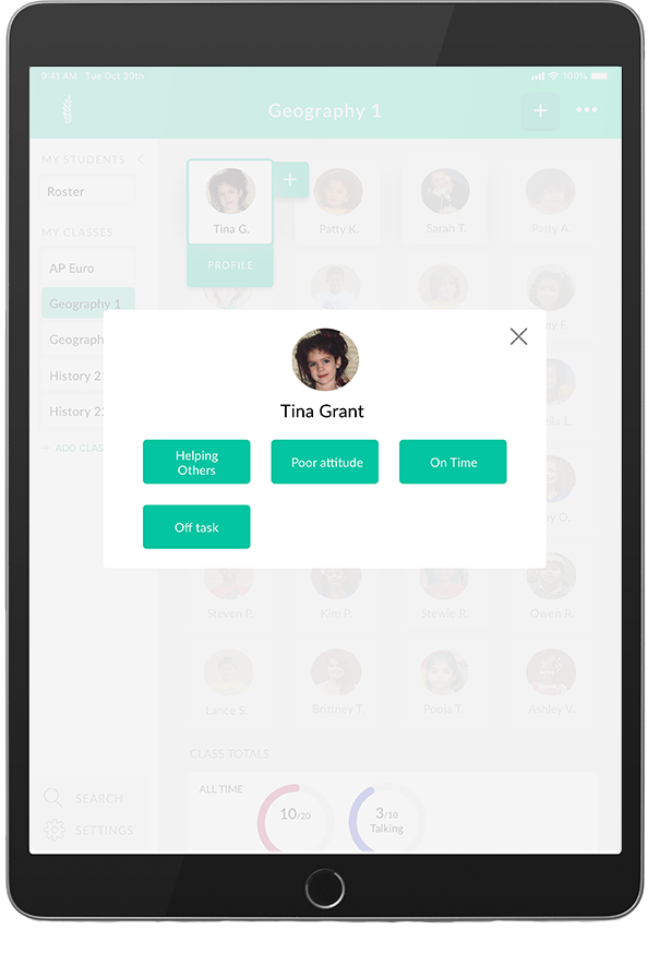
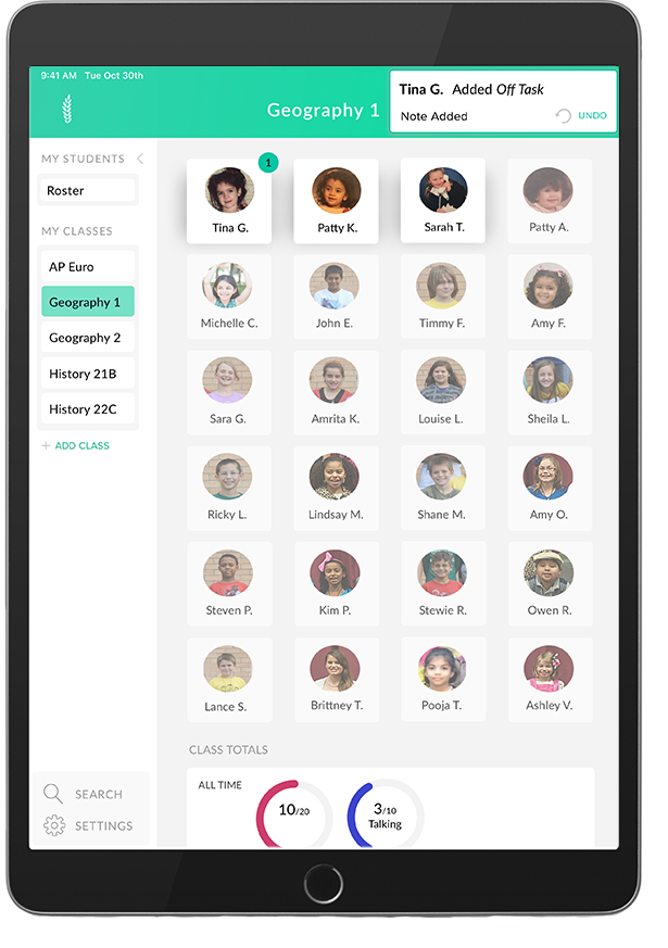
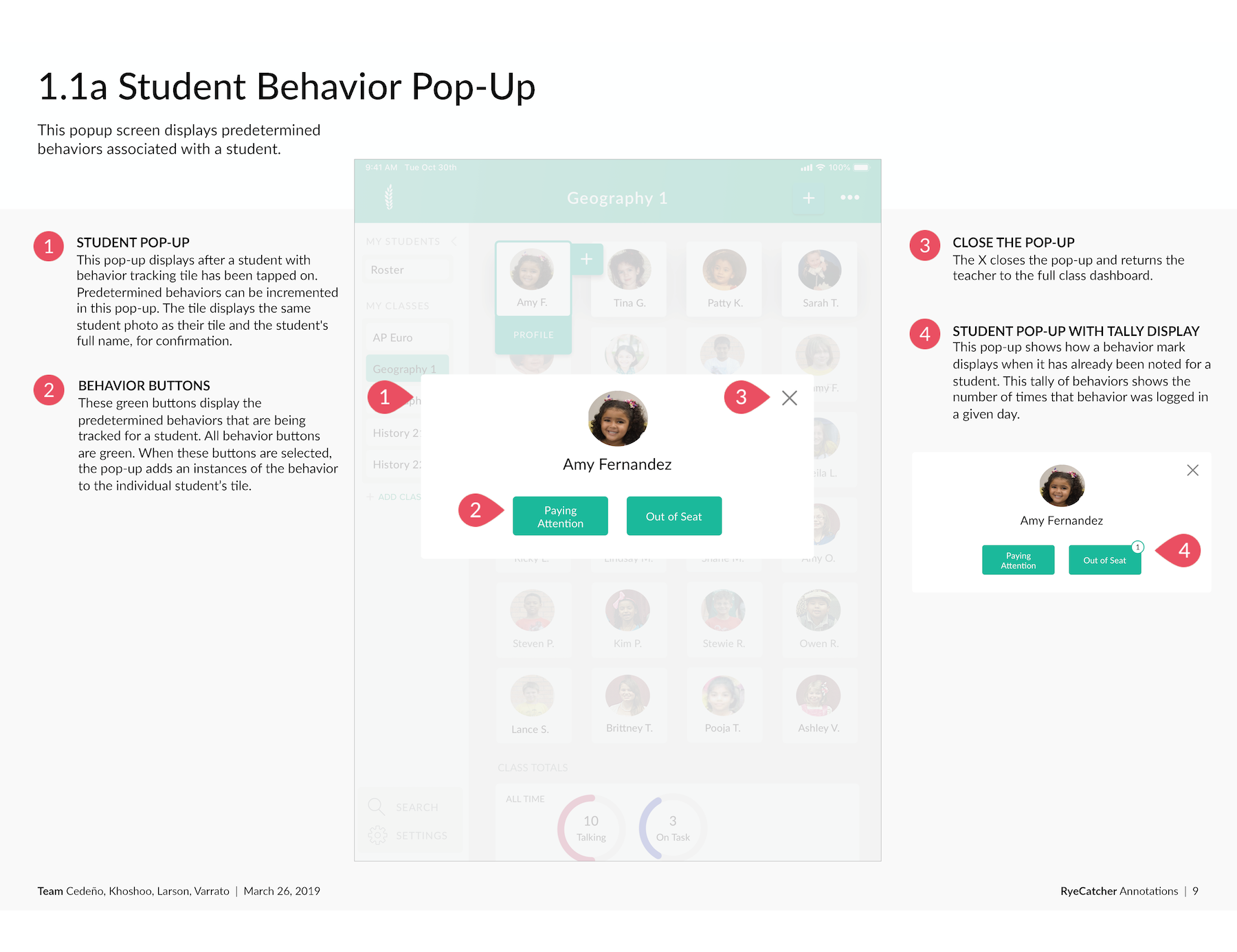
Teachers can track student behavior by tapping track mode, then a student name. A popup surfaces asking for behaviors to track. After a teacher taps a behavior, that instance is tracked an a feedback notification surfaces.
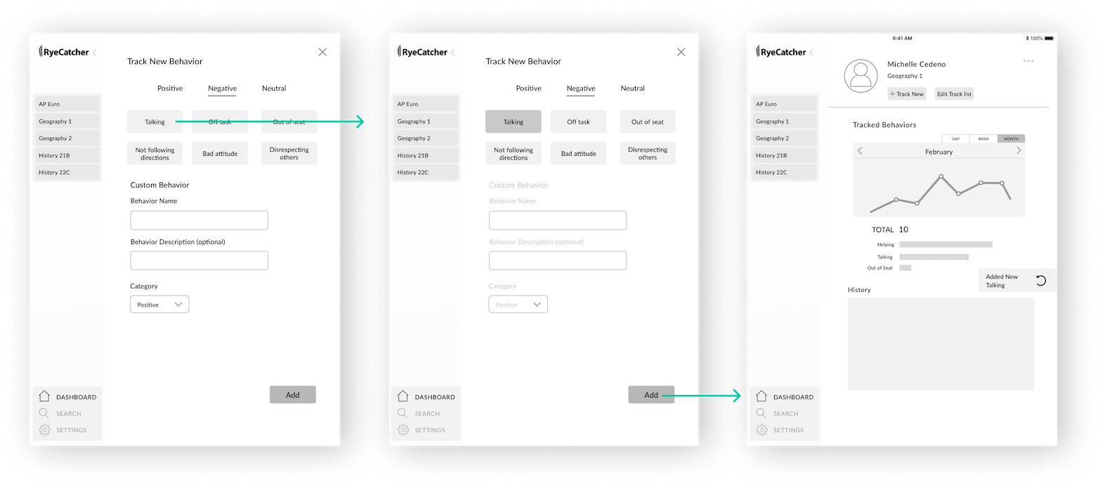
Adding Behavior to Track Flow
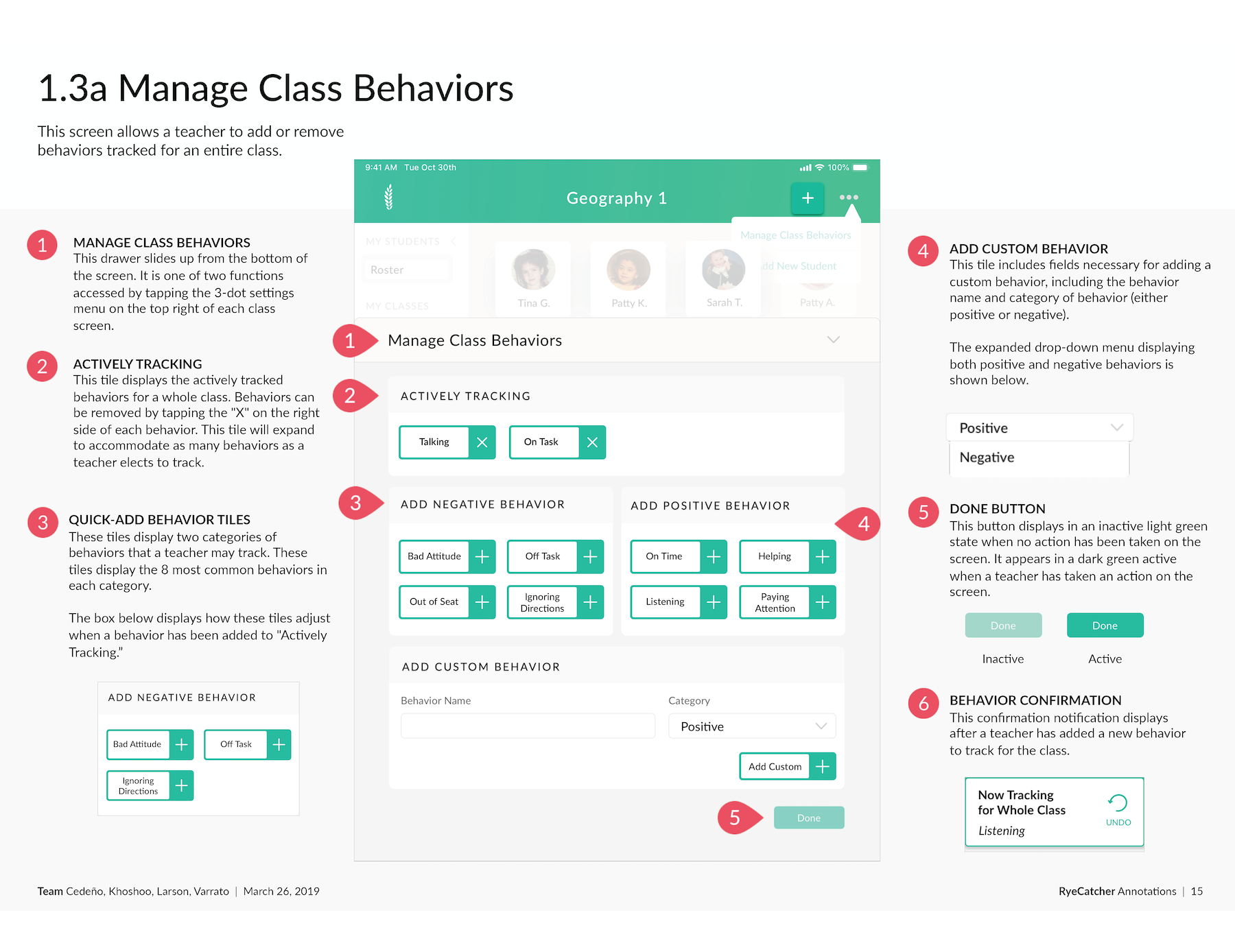
Teachers can set up tracking by class or by student by tapping the three dots to the upper right of a class or student profile page. Flow is similar: tap dots, add behavior, receive feedback notification.
During our first client feedback session, we jotted down major notes and changes on our paper prototype. We then reviewed feedback as a team and decided which what to incorporate and iterate upon.
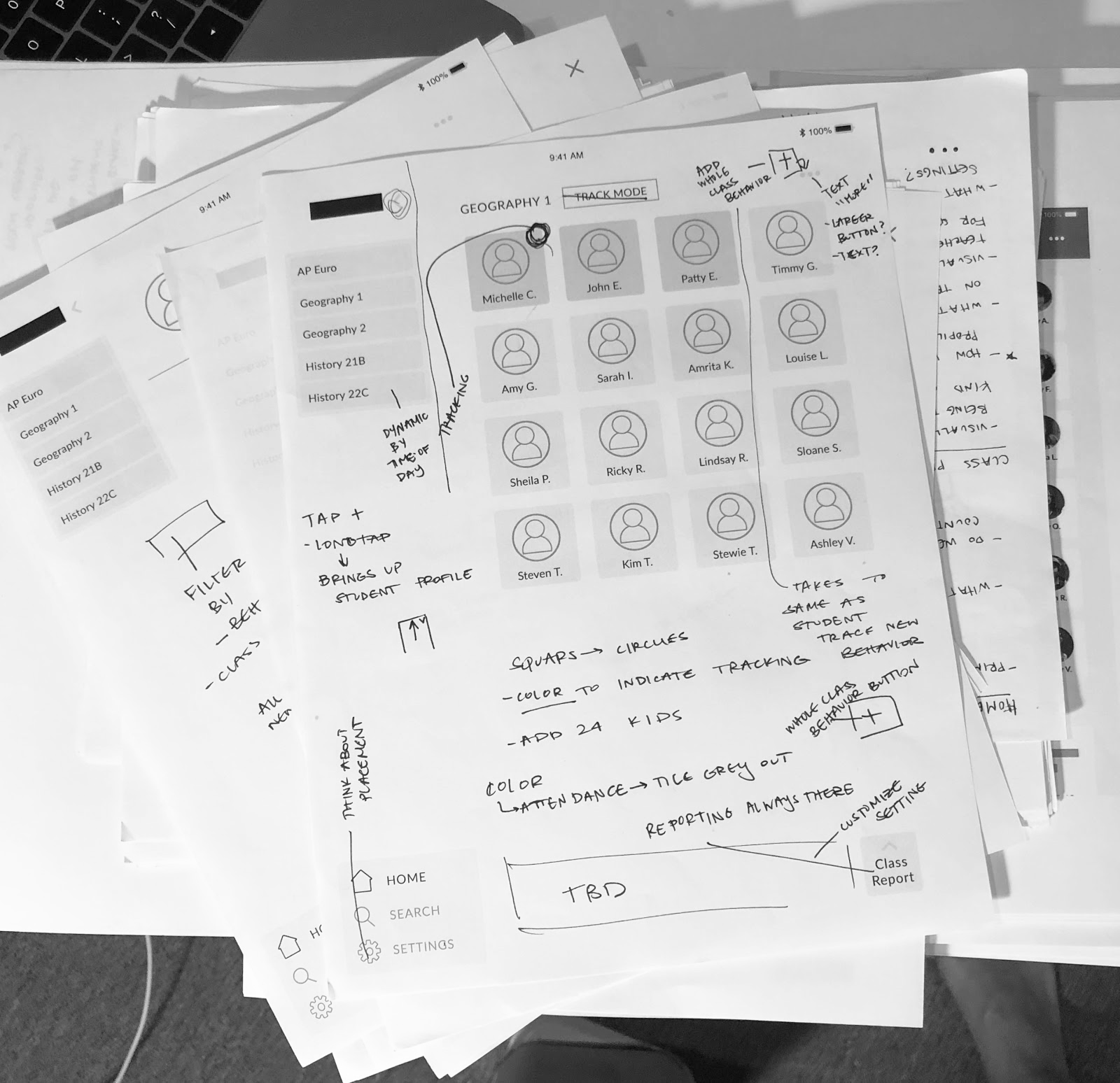
Key changes included eliminating a "track mode" feature, making tracking indications more discrete, and adding additional demographic and behavioral plan information to student profiles. We also decided to incorporate RyeCatcher's green primary color because we wanted to test for visual cues in our upcoming evaluative research.
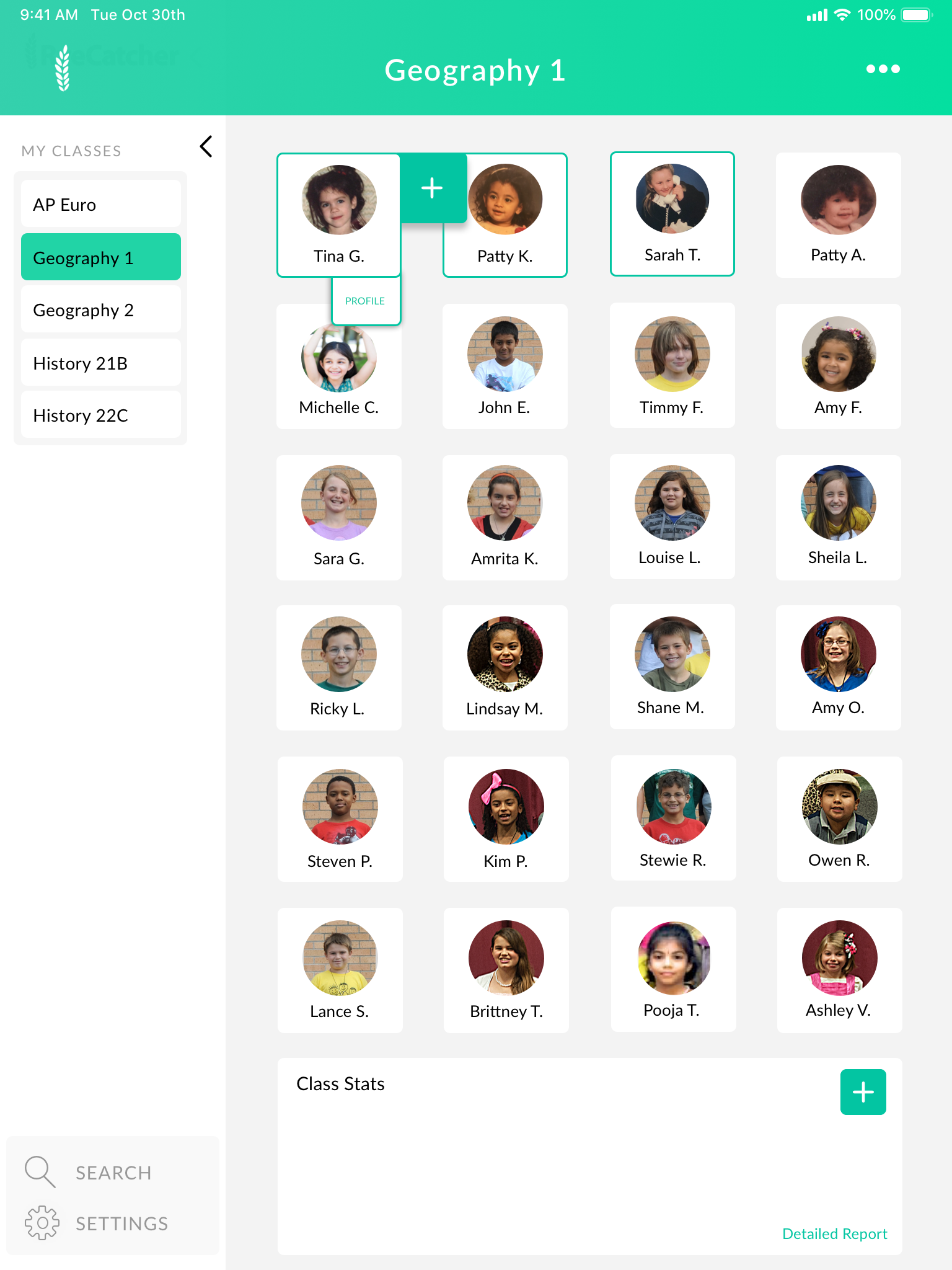
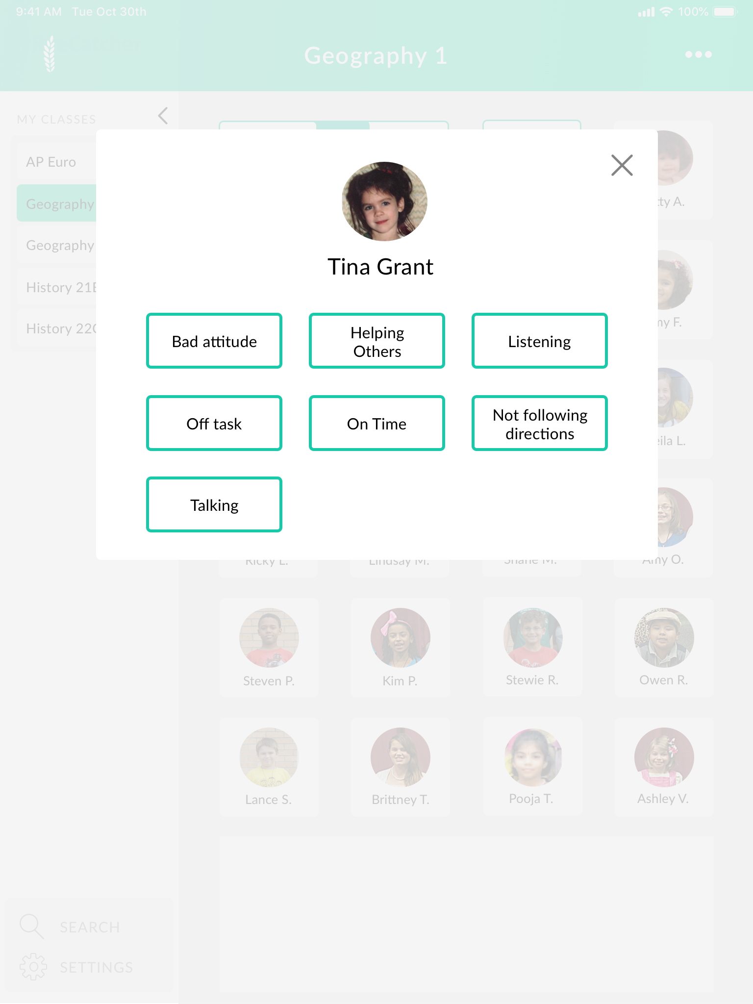
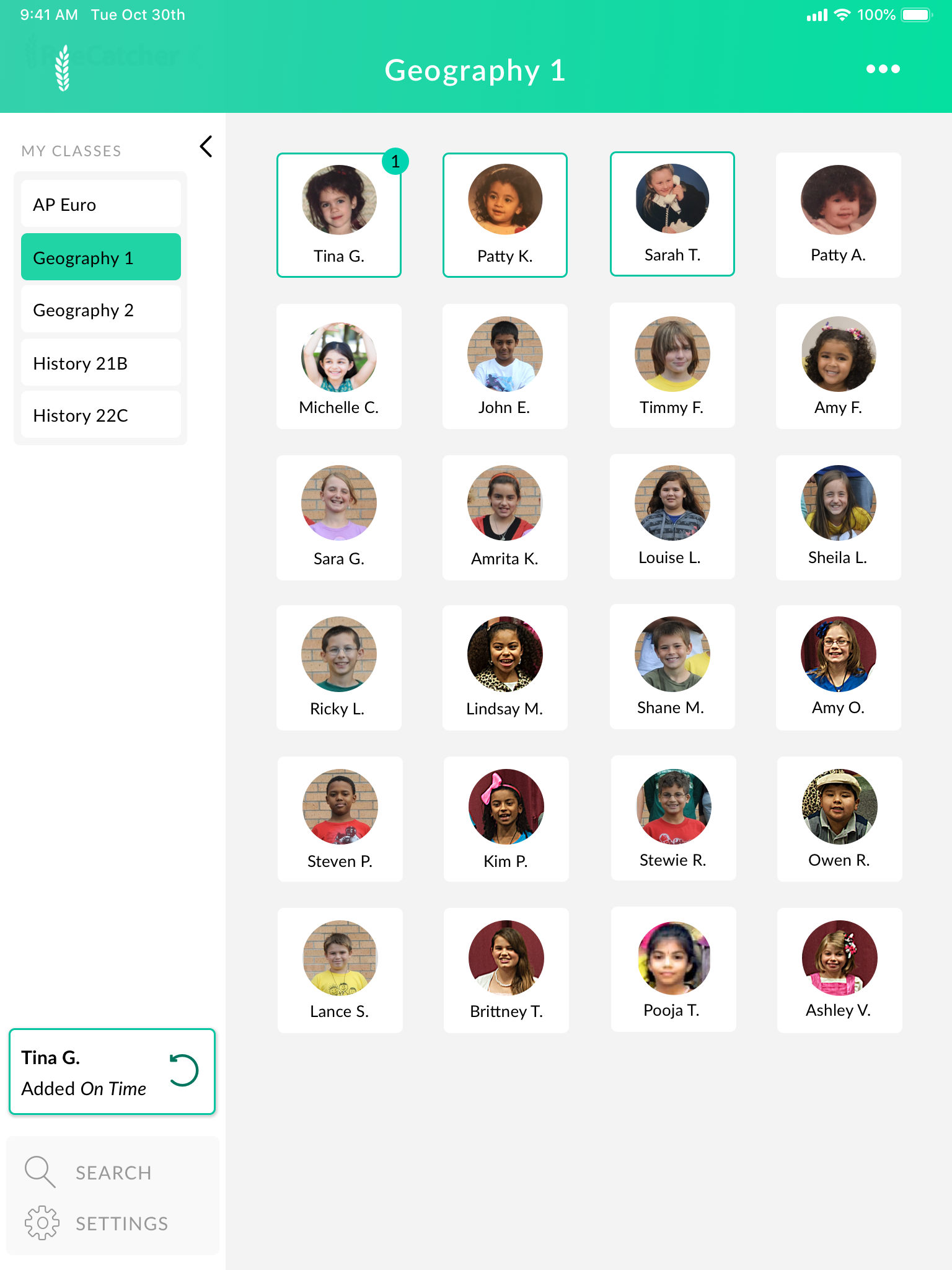
Class Home & Student Tracking Flow
We simplified our tracking flow by reducing taps. We also added controls to student thumbnails, visual cues for students who have individual tracking, and changed the placement of our notifications.
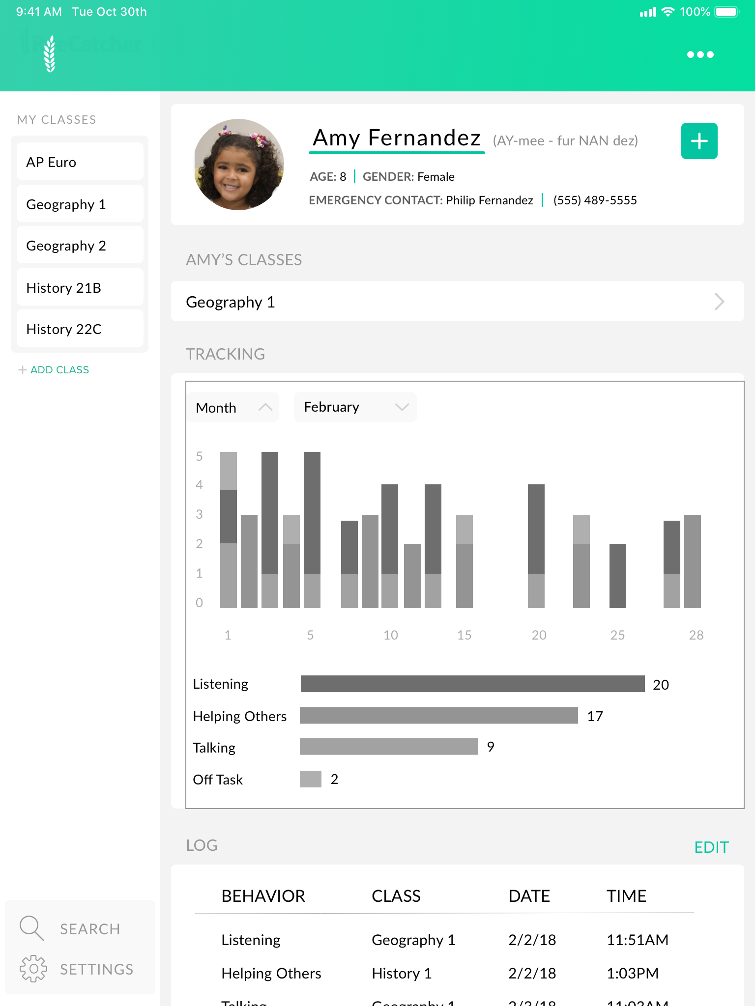
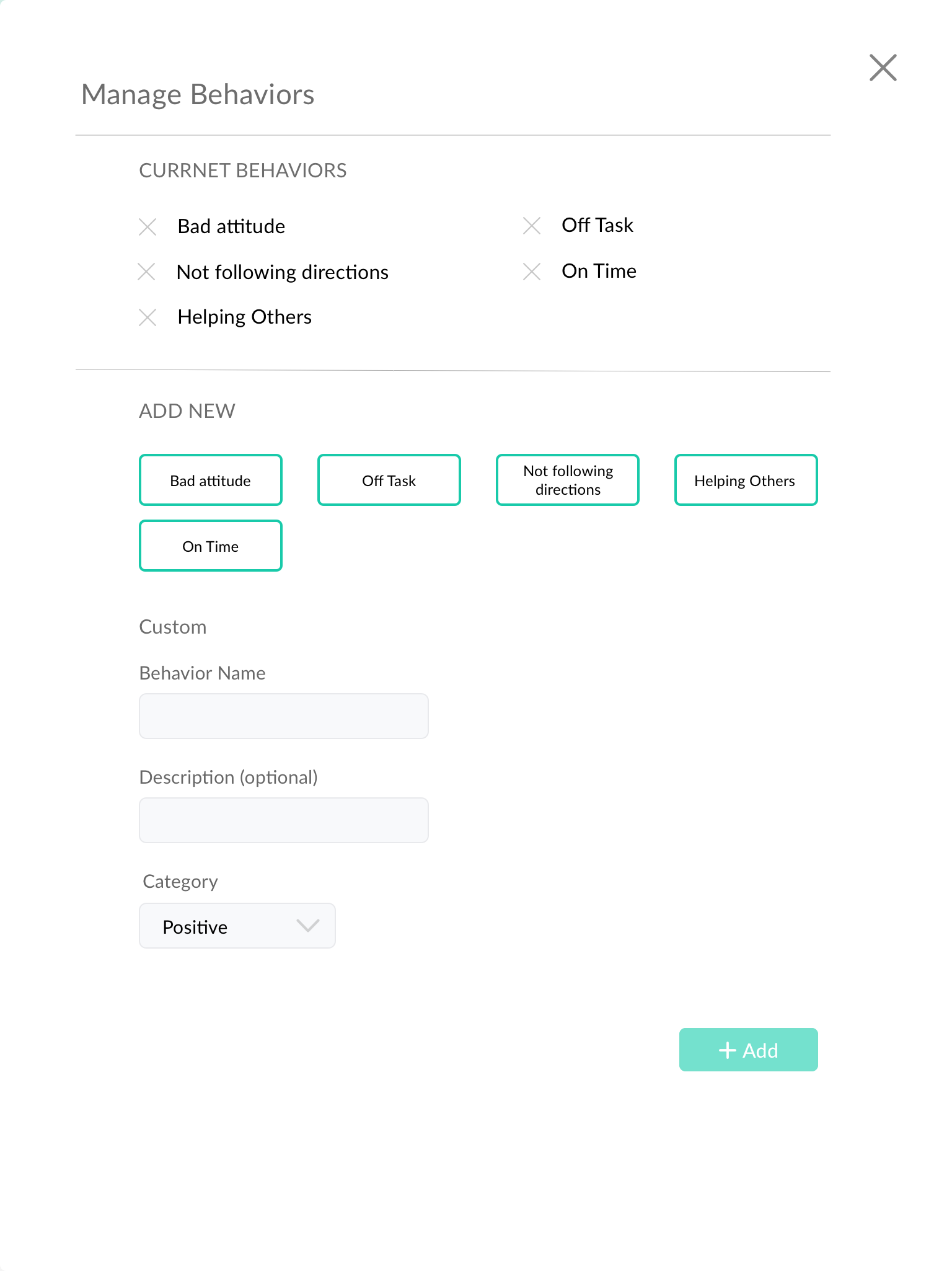
Trend Analysis & Adding Behaviors
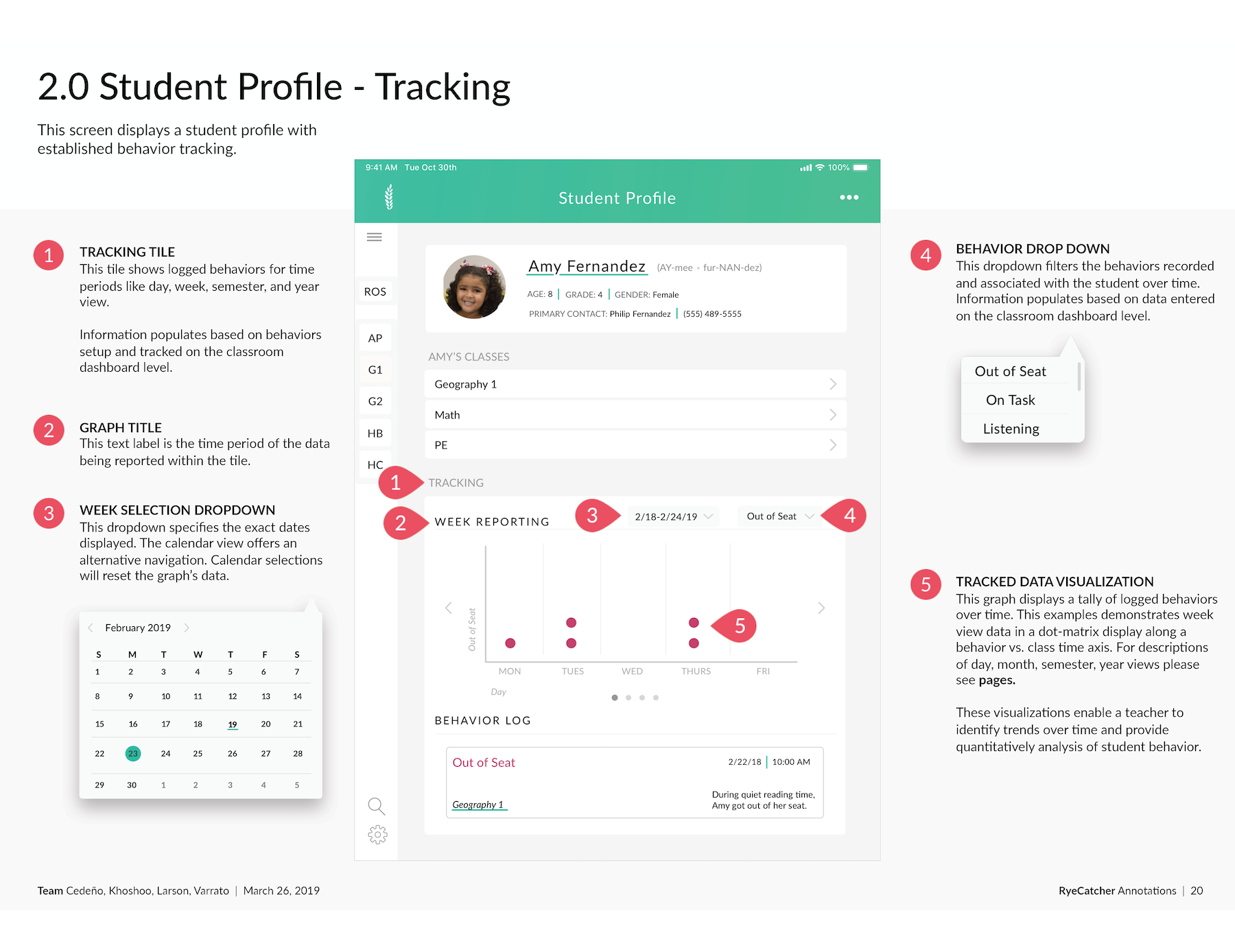
We added more demographic and behavior plan information. We also added a new data analysis view, historical log, and add behavior pop up. We hoped to test these concepts in evaluative research.
Updated Information Architecture
Through each iteration, we continued fleshing out and updating our app's information architecture.

Evaluative Phase
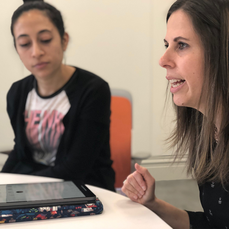
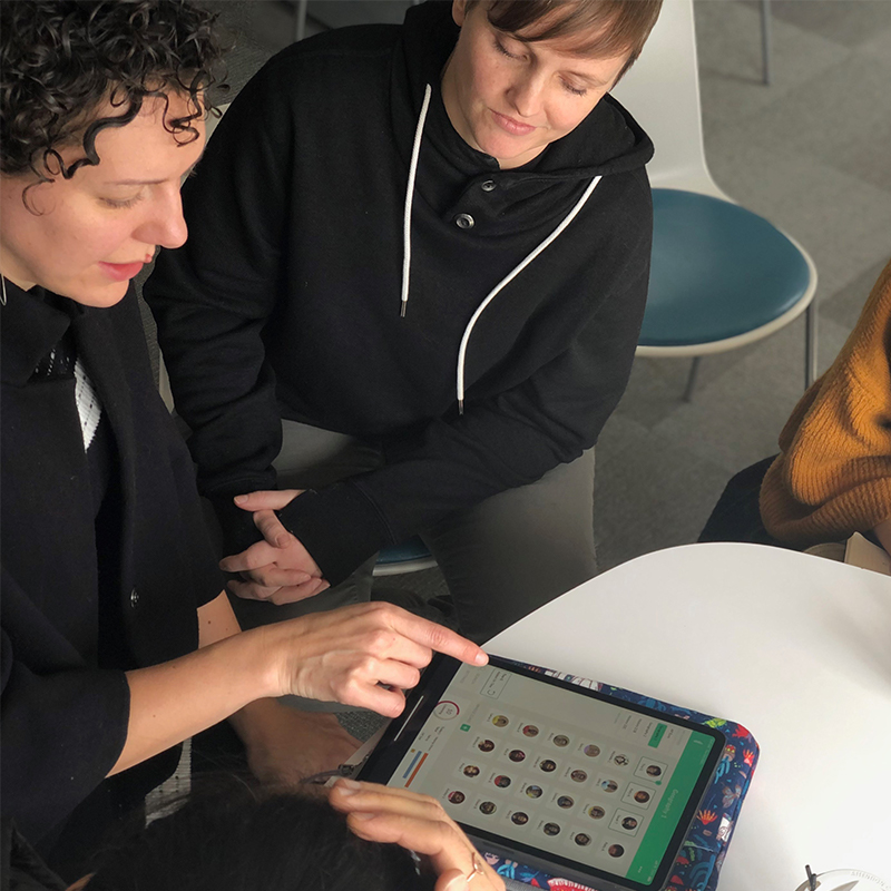
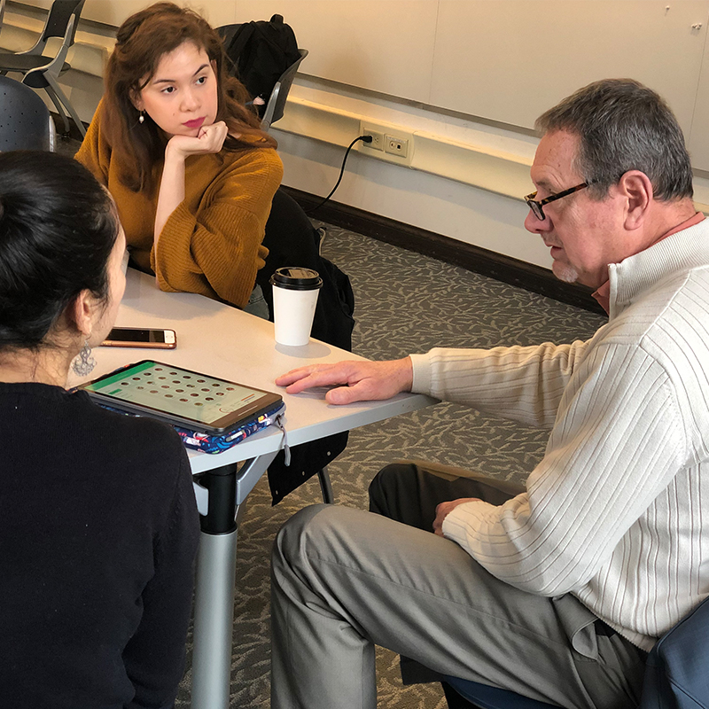
We then moved into evaluating version 2 of our tablet app. We ran interviews and usability tests with 3 educators with a range of K-12 experience. These interviews helped us identify features and themes to focus our design. We first asked teachers open-ended questions to better understand their experience with behavior tracking and then moved into usability testing. During our usability tests, we asked each teacher to complete 4 major tasks with our digital prototype.
We had four key insights from evaluative research:
01
The app is efficient, easy, and friendly to use.
The class dashboard is easy to navigate and adding behaviors is intuitive. Metrics are helpful and easy to understand. The large green buttons give the app a friendly feel.
02
Tracking behaviors should be quick and discrete.
Because teachers will be using the app in a classroom setting, students have visibility. We should remove positive, negative, and neutral color indications as the iPad might be seen by students. Also, reduce the number of taps teachers have to take to track behaviors and access information.
03
Give teachers more information about individual students.
Information should be more accessible and comprehensive for teachers. The app should indicate when a student is on a behavior plan (IEP, 504) and relevant demographic information.
04
More customizable trends views.
Teachers need to view trends over time both at the class and student level. These trends are useful to know on a daily, weekly, monthly, and by semester scale.
Refinement Phase
Finalizing Interactions
We worked on incorporating feedback into the next iteration of our design. This iteration focused on making tracking and app-use discrete, efficient, easy to use on the go, and friendly. Given teachers are tracking in real-time, we also worked on minimizing the number of taps teachers have to take to track behaviors, add notes, and access information. We also continued fleshing out student’s profiles, adding more demographic, behavior plans, and data trend information.
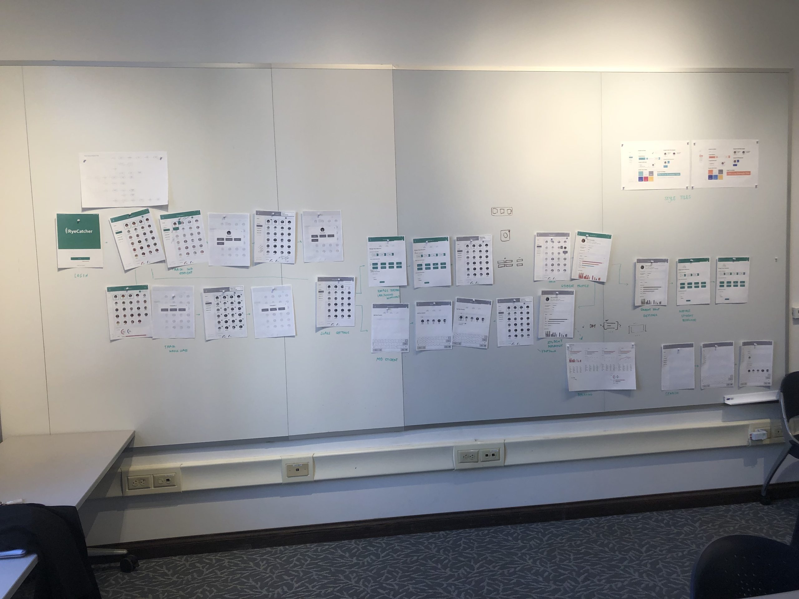
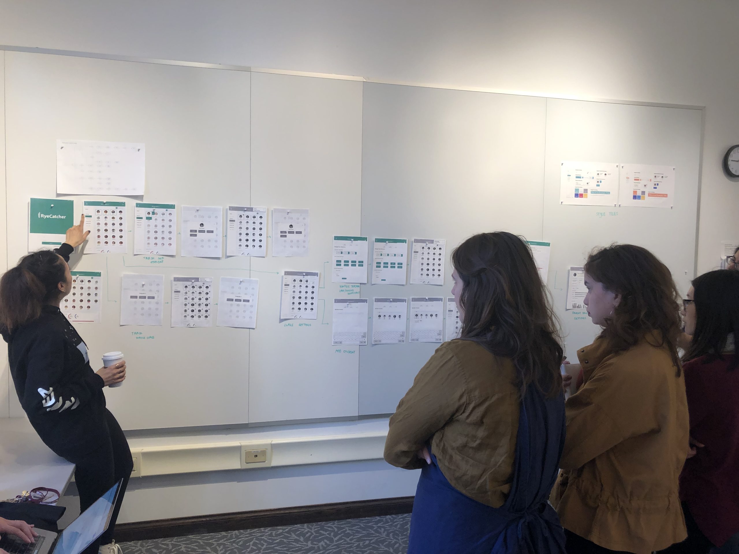
critique session
As we moved into finalizing interactions, we held a design critique with our clients, peers, and instructors. We walked everyone through our macro and micro-interactions. After the session, we were able to incorporate feedback and push our design forward.
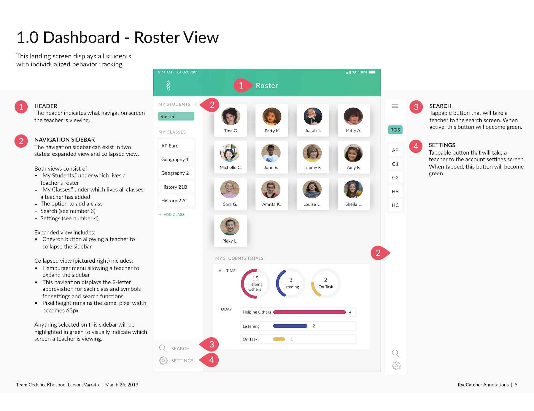
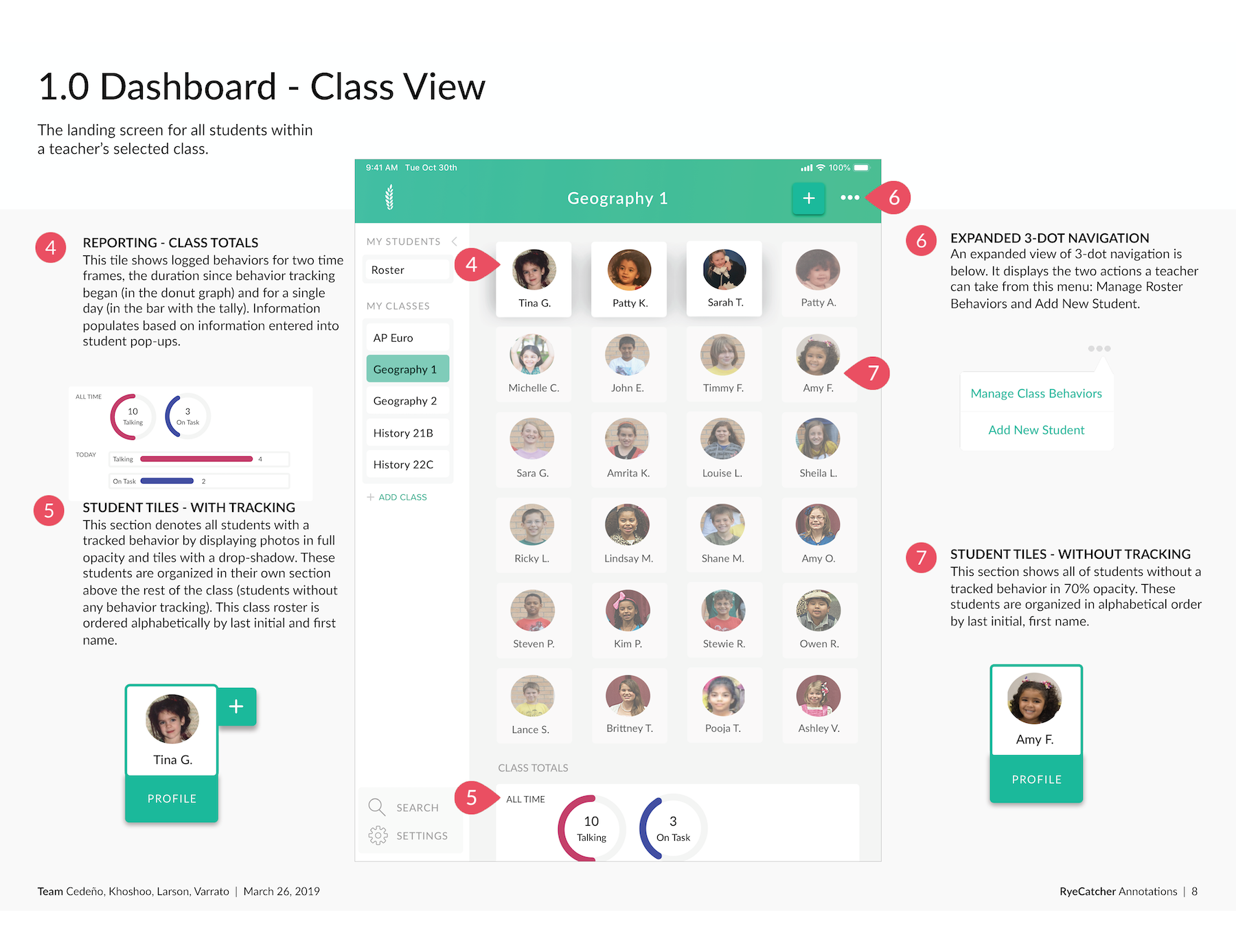
Final Annotated Wireframes
We created a detailed document outlinining all macro and micro-interactions. For our full annotated wireframe document, please visit: RyeCatcher Annotations.
What's next?
We hope to continue exploring archiving behaviors and tracking over multiple years, organizing information for multiple educators, and personalization within the app.
© 2022 — Amrita Khoshoo